
Tags:
Modal dialogues are a part of the web whether we like them or not, and there's plenty of reason to not like them when they're implemented in a really intrusive way. They do serve a very useful purpose though; they allow extra content to be presented to the user in a way that temporarily breaks out of the normal flow of the page without altering the existing content flow.
Contents
- What Should They Be Used For?
- How Can They Be Inaccessible?
- It's All About Semantics
- Don't Forget Keyboard Users
- Stopping the Scroll
- In Conclusion
What Should They Be Used For?
Dialogs are great for presenting small bits of content, be that a notification message or asking your user an important question. Great examples are:
- an alert to a user about a loss of connection to the servers
- notifying an exam taker that their allotted time has come to an end
- asking a user if they want to delete their profile
- presenting the visitor with a small form to select which social network to share the chosen photo
What they are not good for is displaying large content blocks (anything that requires scrolling on a typical small screen).
How Can They Be Inaccessible?
Even for a fully able-bodied user, modal dialogues can be awkward to use. If they contain too much content, the user is forced to perform a vertical scroll in a possible already scrolling page. This example from a Sharepoint 2013 tutorial page highlights what not to do:
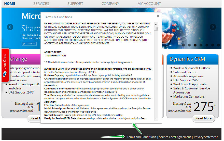
If the page scrolling is not disabled, they'll have issues with returning to the place on the page they left.
For a user with a visual disability, they can create a terrible user experience, with people being unaware that any notification was triggered, or worse; finding they need to tab all the way to the end of the page to move focus to the modal!
It's All About Semantics
Probably the golden rule to remember for accessibility is to always use semantic markup where possible. I cannot stress enough how important this is. You can make a beautiul component for your website, but if it's not using semantic code, then it might as well be written in Klingon for all the use it will be for your visitors who suffer from a visual disability.
Typically, to use semantic markup means using the specific HTML that corresponds to the type of thing you're presenting. For example, headings should use <h1> through <h6>, and not <div> tags, lists should use <dl>, <ul>, or <ol>, and abbreviations should use <abbr> (but only for their first use on a page).
Sometimes though, we come across requirements for which there just is no built-in HTML tag and we have to roll our own. Now, there are 3 modal dialogues built into JavaScript since the very early days; alert(), confirm(), and prompt(), and they're all awful and about as flexible as a wrought iron bar when it comes to customising them. Not just that, but if your needs go beyond what they can provide then you're left with no choice but to roll your own:
<div class="modal">
	<button class="cancel">Cancel</button>
	<h2>Share Photo</h2>
	<p>Where would you like to share your photo to?</p>

	<form>
		<button id="share_by_email">Email</button>
		<button id="share_to_facebook">Facebook</button>
		<button id="share_to_twitter">Twitter</button>
	</form>
</div>
Thankfully, in these situations, there is ARIA to the rescue. It brings to the table a whole bunch of attributes that can be added to your HTML to add to or alter the underlying semantics for just about anything.
Picking a Role
The first change we'll be making is to add a role to the modal, which indicates that this is a dialog. This means that your modal gets identified as a modal within the accessibility tree of the browser. This lets the browser (and accessibility plugins) to treat the dialog content in a different way from standard text.
<div class="modal" role="dialog">
...
</div>
The role dialog is generally preferred over the alternative alertdialog, which is considered a bit intrusive. I would tend to give more weight to what Marco has to say, as he relies on accessibility tech himself, and works at Mozilla, so he's pretty involved with web accessibility in particular.
The MDN documentation is a bit more neutral on the subject, but does offer specific advice about usage of alertdialog with regards to the content.
Labels and Descriptions
Consider a car. Now, that car might be a family saloon, or maybe even a track race car; that's the role. This car also has is a make, its identifying label, and a set of characteristics (e.g. engine type, colour, etc) which is the cars description.
Our dialog also has a label and a description (although the modal might be simple enough that the label describes it sufficiently, in which case the description is optional).
There are two ways to label a modal; one is using the aria-label attribute, the value of which is the full label for the dialog. The other way is to use the aria-labelledby which references the value of an id within the dialog. Personally, I use the latter always, as I believe if the label is important enough for users relying on assistive tech, then it's important enough for everyone, so it should be within the content of the modal.
The dialog description is identified by aria-describedby, which must reference the id of an element inside the dialog. This property is optional however, but I would recommend using it if the content of the modal conveys important information which you wish conveyed to your users. You can also specify several ids, separated by spaces, but if you have to use many ids, your dialog may be overly complex.
This changes our modal HTML to this:
<div class="modal" role="dialog" aria-labelledby="share_heading" aria-describedby="share_description">
	<button class="cancel">Cancel</button>
	<h2 id="share_heading">Share Photo</h2>
	<p id="share_description">Where would you like to share your photo to?</p>

	<form>
		<button id="share_by_email">Email</button>
		<button id="share_to_facebook">Facebook</button>
		<button id="share_to_twitter">Twitter</button>
	</form>
</div>
Don't Forget Keyboard Users

Even for your site visitors who have no visual disability, there are still problems that a typical poorly thought-out modal dialog can cause. One particular aspect that is often overlooked is how a user navigates your website. There are many issues that result in people not being able to use a mouse of touch screen:
- Missing limbs or limbs unable to hold a mouse or screen pen
- RSI or other problem which can make mouse use uncomfortable
- Loss of fine motor control, such as Parkinsons sufferers
- Even ⅓ of women suffer from Carpal Tunnel during pregnancy
For all of these issues, the sufferers may fall back to using a keyboard or other device which emulates a keyboards behaviour. As well as this, it's quite common for users who are perfectly capable of using a mouse to spend short periods relying only on keyboard navigation. You might have seen people do this or done it yourself; you're filling in a form, and rather than use the mouse to move the browser focus to each new field, you just tab into it. If you're not careful, that keyboard tabbing can leave your user in odd situations.
Consider the typical setting for a modal dialog in your markup: to avoid weird issues with z-index, you've put the dialog HTML at the end of the pages source code:
<body>
	<h1>Page heading</h1>
	<nav>
		<ul>
			<li><a href="#">Link to some content on the page</a></li>
			<li><a href="#">Another link to some content on the page</a></li>
			<li><a href="#">Yet another link to some content on the page</a></li>
		</ul>
	</nav>

	<p>Some content here</p>

	<form>
		lots of form controls here which can all receive focus
	</form>

	<p>More content</p>

	<div id="modal" role="dialog" ...>
		modal content here...
	</div>
</body>
Without the proper care and attention, you could run into a few different problems:
- If you don't move the focus automatically to the dialog when it's shown, the user is forced to tab all the way through everything in the page to get to that dialog at the end of the page
- If the user is able to tab out of the dialog, they can still interact with other elements on the page.
- If there's no easy way to close the dialog (such as hitting
escape, then the user needs to tab through everything inside the dialog in order to reach the close button
So what can be done to remedy this? Glad you asked!
Move Focus Where it Needs to Go
There are two parts to getting this right: move focus to the modal when it's opened, and then return focus to the last place it was when the dialog is closed. For this, you're going to need some JavaScript a little bit like the following:
document.addEventListener('DOMContentLoaded', function() {
	let modalAcceptButton = document.getElementById('accept_modal');
	let modalCloseButton = document.getElementById('close_modal');
	let openButtons = document.getElementsByClassName('open_modal');
	let modal = document.getElementById('modal');
	let focusTriggerElement;

	for(let i = 0; i < openButtons.length; i++) {
		openButtons[i].addEventListener('click', function(e){
			showModal(e.target);
		}, false);
	}

	modalAcceptButton.addEventListener('click', closeModal, false);
	modalCloseButton.addEventListener('click', closeModal, false);

	function showModal(triggerElement) {
		focusTriggerElement = triggerElement;

		modal.style.display = 'block';
		modalAcceptButton.focus();
	}

	function closeModal() {
		modal.style.display = 'none';

		if(focusTriggerElement) {
			focusTriggerElement.focus();
			focusTriggerElement = null;
		}
	}

}, false);
The accompanying HTML looks like this:
<button class="open_modal">Open modal button 1</button>
<button class="open_modal">Open modal button 2</button>
<button class="open_modal">Open modal button 3</button>

<div id="modal" role="dialog" aria-label="Accept this thing">
	<button id="close_modal">Close</button>

	<p>This is the modal content</p>

	<button id="accept_modal">Accept</button>
</div>
The first few lines of JavaScript just set up variables pointing to DOM elements, and attach event handlers. The key is in the two functions for showing and hiding the modal dialog.
The showModal function accepts an element as an argument, this element is the one which triggered the dialog to open. In our case, that's one of three buttons. Then it displays the modal and focuses on the 'Accept' button within it.
closeModal is pretty simple too. It hides our dialog again, and if the focusTriggerElement has been set, it focuses on the element it contains and then unsets focusTriggerElement. This is just a safety thing to avoid errors in the console in-case somewhere there might be other code that ends up calling the close method and nothing triggered the open correctly.
Whichever button you use to trigger the modal opening, focus is always returned back to it once you close the modal. For the sake of simplicity, I've left out the CSS that makes everything look nice and sets an opaque background that prevents interaction with the rest of the page.
Trap Focus in the Modal
One problem that affects all users is ensuring that they must interact with the modal dialog before continuing on to the rest of the site. The most typical way of achieving this is to add an overlay to the background of the modal that covers the entire page. On way to do this might involve the following HTML and CSS:
<div id="modal">
	<div class="modal_content"  role="dialog" aria-label="Accept this thing">
		<button id="close_modal">Close</button>

		<p>This is the modal content</p>

		<button id="accept_modal">Accept</button>
	</div>
</div>
#modal {
	background-color: rgba(0, 0, 0, .4);
	left: 0;
	height: 100%;
	position: fixed;
	text-align: center;
	top: 0;
	display: none;
	width: 100%;
	z-index: 1;
}

#modal::before {
	content: "";
	display: inline-block;
	height: 100%;
	vertical-align: middle;
}

.modal_content {
	background: #fff;
	display: inline-block;
	padding: 1em;
	position: relative;
	text-align: center;
	vertical-align: middle;
	z-index: 1;
}
This is a decent start, and for people who use only a mouse to click at things on the page, it does the job. To fix it properly though, we need some more JavaScript:
Firstly, we need to modify the two functions responsible for showing and hiding the modal:
function showModal(triggerElement) {
	focusTriggerElement = triggerElement;

	document.addEventListener('keydown', handleKeyDown, false);

	modal.style.display = 'block';
	modalAcceptButton.focus();
}

function closeModal() {
	modal.style.display = 'none';

	if(focusTriggerElement) {
		focusTriggerElement.focus();
		focusTriggerElement = null;
	}

	document.removeEventListener('keydown', handleKeyDown, false);
}
This adds and removes the event listeners relative to the open state of the modal dialog. The reason for doing it this way is to avoid handling key presses on the rest of the page when we don't need to.
Next are two new functions:
function handleKeyDown(e) {
	let tab = 9; // the keycode for tab

	if(e.keyCode == tab) {
		handleTab(e);
	}
}

function handleTab(e) {
	let focusableElements = modal.querySelectorAll('button, a, textarea, input')
	let focusableElementsAmount = focusableElements.length;

	if(focusableElementsAmount == 1) {
		e.preventDefault();
		return false;
	}

	let firstElement = focusableElements[0];
	let lastElement = focusableElements[focusableElementsAmount - 1];
	let shiftPressed = e.shiftKey;

	if(e.target == lastElement && !shiftPressed) {
		e.preventDefault();
		firstElement.focus();
	}

	if(e.target == firstElement && shiftPressed) {
		e.preventDefault();
		lastElement.focus();
	}
}
The reason for splitting the code into two functions is to allow us to deal with other key presses later on, but for now it's only checking for, and handling, the tab.
The real work is done inside the handlerTab() function. First, it creates a list of DOM elements (using the modal variable we created in global scope earlier) which can be focused. This is pretty simplistic, and doesn't take into account whether the elements are hidden or not, but for this demo it is fine.
If this list only contains 1 item, we want to explicitely just cancel the event and do nothing because there's nowhere else to tab to. Next, we create references to the first and last elements, and one to identify if the shift key was pressed during the keyboard event.
If the event was triggered from the last element (meaning it was the one that had focus) and the action is just a regular tab forward (the shift key was not pressed), so we move focus manually to the first focusable element and then cancel all further default actions.
If the event was triggered from the first element, and the shift key was pressed, then move the focus to the last element and cancel all further actions for this event.
Let the User Escape!
One thing that is pretty common for any modal dialog, is that it can be easily dismissed by pressing the escape key. With the work we did above to capture and handle all tab events, we can easily accomplish this for our modal. It requires a very small change to the handleKeyDown() event:
function handleKeyDown(e) {
	let tab = 9; // the keycode for tab
	let escape = 27; // the keycode for escape

	if(e.keyCode == tab) {
		handleTab(e);
	}
	if(e.keyCode == escape) {
		closeModal();
	}
}
That's it, now if the modal is open, and the user presses escape, the modal will be closed.
Stopping the Scroll
There's one more thing that could create a weird experience for your users; scrolling while the modal is open. If you don't prevent scrolling on a page with a lot of content while the modal dialog is open, they could continue to scroll the content behind the dialog without realising, resulting in them ending up somewhere they don't expect when the dialog is closed (a lot of browsers don't automatically scroll to the element that received focus).
Thankfully this is easy, you just need to set a few CSS properties on the <body> tag (or whichever content tag is most appropriate):
overflow: hidden;
A few times I've seen it advised to also add a position: fixed, but this creates another problem, namely it always scrolls to the top of the page when applied. Obviously, this is not what we want.
In Conclusion
Modal dialogs are not evil, they're just tools, and like any tool, can be used well or abused. Here are a few basic rules to remember:
- Don't overuse them, they break the reading flow, and this increases the cognitive load.
- Only use them for small amounts of content, short messages, simple forms, or questions with only a few options as answers
- Avoid modals triggered from other modals; just don't use them!
- Modals should only ever be triggered by user action; if a user isn't expecting to see one, their overall experience is worsened
Comments