Tags:
Since the inception of the GDPR (General Data Protection Regulation), cookie banners have been a common part of the web, and like all things on the web, there is plenty of room for accessibility issues.
Contents
What Are Cookies?
Within the context of the web, cookies are small text files that can be used to store small pieces of information in your browser. Most of the time these things are entirely harmless, such as remembering a preference you've set on a website for the next time you visit. However, sometimes they can be used as a means of tracking your browsing from site to site.
How They Are Used To Track You?
Let's take the example of a fictional website that has allows people to post photos and leave comments on those pictures. That site will probably use a couple of cookies to remember you as you go from page to page, and ensure that nobody is maliciously posting things under your user without your knowledge:
laravel_session: random_string_of_letters_and_numbers;
XSRF-TOKEN: another_random_string_of_letters_and_numbers;
These cookies are linked to the website you're visiting, so your browser only allows them to be accessed when visiting that site.
The more sinister side of cookies is where they are set by advertising groups. These are usually huge companies that serve adverts to millions of websites, and the cookies they set can be checked every time they serve you an ad. Every time they check those cookies, they know the website you're on right now, so they make a record of that. When you visit another site, the same cookie is checked with the new adverts, and now that advertising company knows another website you're visiting.
Over time, a great amount of information can be gathered about you, the sites you visit, the time you spend on them, the things you're interested in, and especially any adverts you click on.
The GDPR
The General Data Protection Regulation was intended to give more rights to individuals over their data, giving you the right to see the data held on you by any company, the right to be forgotten, and also the right to opt-in to being tracked.
Unfortunately, what most companies have taken this last one to mean is: "let the user choose which cookies they want". This isn't entirely correct. When I last checked, the word "cookie" was only mentioned once in the text of the GDPR. Yet this has been one of the largest things to be focused on by every company website across the world.
Ignoring the obvious misunderstanding around tracking, there is the elephant in the room, the accessibility of these cookie banners and modals.
The Accessibility of Cookie Banners
I tested a series of websites cookie modals and banners to see what issues they might have. My testing wasn't exhaustive, but gives an indicator about the problems people will face when encountering these modals with every website they visit.
metro.co.uk
When the modal is initially shown, the screen reader did not immediately alert it as new content on the page, and in-fact the main page content can be tabbed into normally, even though the content is obscured by the modal. For blind people the banner is virtually invisible unless they tab to the very end of the page, and for sighted persons relying on a screen reader it is very disorientating to see different content than that which is being read out.
Moving on to the keyboard access: of all the websites tested, this was the only one that was completely innaccessible via the keyboard.

Due to this, a user relying on keyboard access is never able to opt out of the tracking fully. Also, none of the option checkbox/sliders were accessible via the keyboard.
The rest of the tests weren't quite as bad, but were not altogether great either. None of the main call to action buttons had any focus styles at all, so a keyboard user who wasn't using a keyboard would have no idea what button they were actually on. Lastly, the whole modal doesn't make use of semantic markup or specific roles for elements. When someone is relying on a screen reader instead of being able to see what things look like, they need all the extra support they can get to describe what kind of things they are interacting with.
Overall, the cookie modal on the Metro completely fails the most basic checks.
thenerdstash.com
While the modal isn't alerted immediately as new content on the page, it is the first focusable section of the site. Furthermore, focus is correctly locked to the modal, preventing access to the content beneath it.
Keyboard access is good as well, with all the same interactive elements being available via both mouse and keyboard.
The first major failure is the focus styles on the tabbed interface for purposes/vendors. While the interface is surfaced in the best way to screenreaders, without the visual styles, it's not very usable via the keyboard.
There is one more minor failing: there is a blue circled "i" next to some vendors. This is indicated to screen readers as a clickable item, when in-fact it adds a small text popover the can be shown/hidden via a click/space press, but that text content is not accessible to a screen reader. Further, the icon itself fails colour contrast checks, especially being as small as it is.
Other than that, colour contrast elsewhere is good and only 2 clicks are required to reject all cookies.
telegraph.co.uk
On the page load, the cookie modal isn't alerted immediately, and it is the last section that can be tabbed into on the page. This means that a person would need to tab through the entirety of the page before encountering the modal, which blocks the majority of the pages contents visually.
While interactive elements on the modal do have focus styles, they fail colour contrast checks. The main buttons, for example, using a semi transparent pale blue shadow to highlight focus, against a white background.

While it could be better, it's not the worst offender of the mainstream newspaper websites, and it does allow a person to fully opt-out with just 2 clicks.
thesun.co.uk
The cookie modal wasn't alerted as new content and the modal was at the end of the pages content, meaning the user was left tabbing through hundreds of news article links before they reached the banner which was visually blocking the entire website. However, once focus was inside the cookie modal, it was trapped, but only as long as you tabbed forwards. Tabbing backwards would take you back through the page content. It seems that they had attempted to trap focus on the modal, but weren't fully aware of how it all worked.
While all elements of the modal were accessibly via keyboard, the focus styles did fail, relying on a pale blue shadow for the buttons. Anyone who had visual problems would find it difficult to differentiate the colour difference here.
Lastly, the semantics around some elements, especially the tabbed interface, could be improved, as semantics are incredibly important for people who cannot see what an element appears to be.
thegamer.com
This site follows a common pattern of mistakes with alerting the user to the modal, and placing it at the end of the DOM (Document Object Model).
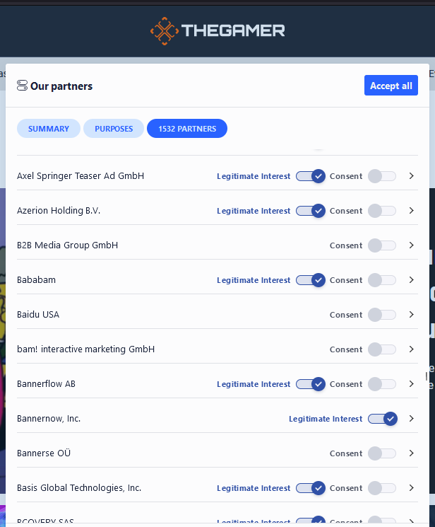
After this, the main issue I found was accessing the tabbed-style interface to get to the purpose and partners sections. The tab labels are presented as toggle buttons, with the active one being the only one that can be focused, and alerted as being inactive. However, I was able to navigate using the arrow keys on the keyboard, but the lack of focus styles made it impossible to determine what happened unless I also ran a screen reader at the same time. This makes the entire modal almost entirely unusable for the majority of screen reader users.
However, the absolute worst offence was the lack of any method to immediately opt-out of all cookies. This meant that, across all the tabs, there were 280 clicks required to completely opt-out of everything! This is, by far, the worst offender of all the modals.

A last oddity is the interactive behaviour with the partners tab when using the keyboard. If you tab backwards into an individual partner then press space to either open or close the details panel, then it will also check/uncheck the first checkbox (either Consent or Legitimate Interest). This weird side effect is not obvious, is not alerted to the screen reader, and is entirely unexpected.
w3docs.com
This site alerts the cookie modal after the main navigation links, even though the modal is at the end of the DOM. This is a good indicator of sensible focus handling, and focusing back to the address bar and tabbing forwards further highlights this. Weirdly, tabbing backwards completely traps focus within the modal, whilst tabbing forwards allows focus to other browser elements, but not the page content.
Next under test was keyboard access. While everything could be accessed via keyboard, sometimes the semantics of an element didn't match the element visually. For example, the "135 TCF vendor(s) and 64 ad partner(s)" link, which looks like a link, and uses an <a> tag, has been given a role="button", so that it presents to a screen reader as a button.

Another issue is the particular usage of icon fonts. These use the <i> tag, which should be reserved for italic text, but here seems to be a lazy attempt at implementing an icon without having to use a <span> tag, or maybe a misguided attempt to save on file size of the HTML? While the <i> tag doesn't normally have any attached semantics, it can, so the usage here is wrong.
Some attempt has been made to use correct ARIA (Accessible Rich Internet Applications) roles for elements, but there has been a gap with fully understanding them. For example, some buttons have been marked up as tooltips, which just means they are not fully supported or alerted to screen readers, in effect becoming a blank element.
Focus styles are missing across all the "View Details" links, and is barely visible at all on the consent checkboxes, which seems to be one of the most common offenses by cookie modals:

Finally, it's a total of 61 clicks to completely opt-out of the cookies on this site, as there's no way to reject them all at once. Not the worst offender in terms of number of clicks, but still bad enough that it causes problems for people.
reddit.com
Reddit's approach is a bit different from other websites tested so far. It uses a banner which inserts itself into the content at the top of the page, pushing down highlighted news/posts, but only on the homepage when not logged in. When logged in and accessing a post page, it uses a more typical banner approach that covers content. In neither case do screen readers alert the user to the cookie banner.
The version that is inserted into the content is the first chunk of the DOM, although visually it appears after the main navigation, which creates a disconnect between what is shown and how it is navigated.
The version that is shown on an individual post page makes the typical mistake of being at the very end of the DOM, meaning a keyboard user must tab through the entirety of the page content in order to reach it, something that would be a long process for a post containing a lot of content or comments.
Neither of the approachs trap the focus, which does make sense as visually they present as banners rather than modals, although the in-post version does block content which isn't a great experience for someone who can see but must rely on a keyboard to navigate.
Further to this, both versions use generic elements and symantics, meaning that assistive tech cannot provide more information about the type of thing that it is. They could, for example, make use of the banner role, which would allow screen readers to present them as such.
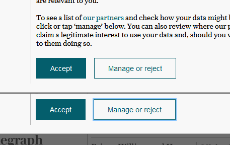
While the buttons and links within the banners do have focus styles, the main call to action buttons have styles that fail colour contrast checks. For example, the in-post version uses a barely perceptable lighter shade of blue to indicate that the accept or reject buttons have focus, as seen here:

Finally, to reject non-essential cookies is as easy to accept all, at only a single click. This is obviously ideal from a user perspective, and puts it among the top of all the tested cookie banners in terms of user experience.
bbc.co.uk
Of all the sites I tested, the BBC came out on top, with flying colours no less. The cookie banner is displayed as a banner rather than a modal, and immediately upon page load the focus is moved to it. While the banner is shown visually at the bottom of the page, it exists within the header at the top of the page, which might be confusing for some people who can see the content and are using a keyboard to navigate.
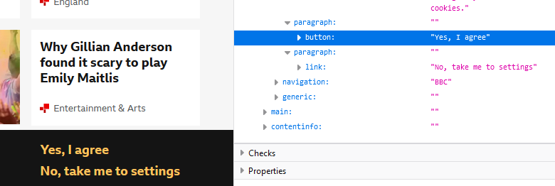
The banner is simple, but makes good use of semantic markup. For example, the main call to action items use a button and link respectively, to reflect their behaviour: links take you somewhere, buttons do something.
Focus styles on all elements of the banner follow the pattern with the rest of the site, in that they are very visible and pass colour contrast guidelines. As well as changing the colour of the text, a two-colour border is added, ensuring the focus is visible regardless of a users colour scheme preference.

Finally, the usability of the banner differs here from most. Rather than allow the user to deselect the individual or groups of cookies in the banner or another modal, the user is taken to a completely different page of the website to do this, and by default the non-essential cookies are not selected. While this user journey could lead to a person being taken away from where they originally wanted to be, because the option is correctly marked up as a link, it allows users to open it up in a new tab more easily to deal with later, and also allows them to more easily understand what will happen when clicked.
twitter.com
The cookie banner on Twitter isn't accounced by a screen reader immediately upon page load, however it does appear before the main content in the DOM. This does mean that it appears sooner in the tabbing order of the website. While focus does cover content, scrolling to the end of the page does allow a buffer margin large enough to ensure that any content can be read with the banner still being displayed. This is good, because the banner doesn't lock focus to itself.
There are focus styles, but they fail miserably on the main buttons, only changing the shade of grey slightly.

The markup doesn't always match the semantics for the cookie banner, which creates some odd experiences for users when navigating it. For example, the "show more about your choices" text appears to be a link because it's given an underline, however the cursor doesn't match this expectation. Instead, it's a <span> tag with role="button"; essentially an element with a multiple identity crisis! Further, while it can be focused, it doesn't allow any click action to be taken by a keyboard, even though it does allow a mouse click.

On a final note, the banner does allow user to opt-out of non-essential cookies as easily as accepting them.
The Overall Results
The most issues affecting the majority of cookie banners that I tested I've detailed in the following table:
| Issue | Affect | Severity | Applicable WCAG Guideline(s) |
|---|---|---|---|
| Colour contrast | People who are unable to see the full range of colours have trouble distinguishing minor differences where colour alone is used as an indicator. Without good contrast, they might miss vital information. | Severe | |
| Keyboard access | People relying on keyboards to navigate depend on all necessary functionality of a website being available to them. If it's not, the website becomes completely unusable. | Severe | |
| Focus management | If an important modal is not set up correctly for keyboard usage, a person may be required to tab through dozens of screens of content in order to reach it. If a modal is blocking content visually and prevents access to content for a mouse, then it should also prevent access to that same content for keyboard access too. | Moderate | |
| Content change alerting | If content is added/removed from the page, a person that is unable to see it may not be aware of any change. The content changes should be made available to screen readers, and should be available in the normal navigation flow where it makes sense. | Moderate/Severe | |
| Focus visible | Any element that can revieve focus should show visually that it has been focused on, in a way that does not rely on colour alone, such as adding a border with enough contrast. | Moderate | |
| Labelling | Elements without labels can be effectively invisible to users relying on screen readers. Add labels to form elements and other interactive elements, and alternative text for images where appropriate. | Severe | |
| Semantic labelling | Content elements that have no semantic role are harder to navigate for people relying on screen readers. For example, a modal containing text that visually appears as a heading with paragraph text and a bulleted list, but is really just a wall of text with line breaks and CSS formatting, will be read out as just that, a wall of text. | Moderate | |
| Content order mismatch | If the content order doesn't match what is visually shown, then users can be confused when their expectations of tabbing order don't match reality. Changing content layout with CSS should generally be avoided. | Minor |
Conclusion
Despite the GDPR not particularly focusing on cookies but rather on unwanted tracking, cookies are nevertheless now the outcast member of the web family, and because of this, cookie banners are part of the web experience for the foreseeable future.
The cookie banners today show a wide variety of accessibility issues that make them difficult or impossible for some people to use. Putting aside the legal ramifications of those problems, not addressing them means not caring about the users. When you consider that we are all in temporary states of being abled, at one point or another of our lives we may well suffer to the problems highlighted in these websites. The GDPR has been established for a long while now, so we should not still be seeing these issues. My testing discovered a lot of basic and easy-to-remedy bugs that can only point to a lack of testing and consideration.
We can all do better.
Comments