Tags:
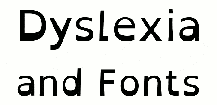
Generally, when asked about web accessibility, peoples first thoughts tend to go towards visual impairments. One group of less obvious issues is that of learning difficulties, such as dyslexia. Dyslexia affects about 10% of the UK population according to the British Dyslexia Association. Being a hidden disability, it's often overlooked in any web accessibility checks.
Contents
- What is Dyslexia
- Can the Choice of Font Help?
- What are Traits of Readable Fonts?
- Good Fonts for Dyslexia Sufferers
- Available Fonts
- Other Usability Tips
- Conclusion
What is Dyslexia?
Dyslexia is defined specifically as a learning difficulty, not a learning disability. The major distinction is that there is no affect on intelligence, only the ability to learn information. Quite simply, if you find it difficult to read, you will struggle to learn. The problems a dyslexic sufferer may endure include some of the following, although the effects are more spectrum-like than an all or nothing deal:
- Difficulty reading and writing
- Problems with putting letters the right way round, and sometimes similar letters will be mirrored, which leads to difficulties comprehending precise words
- Struggling with ordered steps in a process, e.g. creating and following plans, or following written instructions
Obviously, this a detrimental affect for the typical web use by dyslexia sufferers, as a massive part of the web is text-based web pages. It can be incredibly difficult for some visitors to read small paragraphs easily, let alone large walls of text (but then again, who can‽). Over the past couple of decades though, there has been some research and development into the affect of fonts and dyslexia.
Can the Choice of Font Help?
There are quite a few fonts available that are said to help with dyslexia, both free and paid, specifically designed and coincidentally helpful.
Do they really work though? While a lot of the fonts that have been specially created for dyslexic users have been created based on the detailed findings of a lot of research, there are some who will note that the fonts themselves need further study as to their effectiveness. However, there are studies that have noted clear improvements in readability of text for dyslexia sufferers just by changing the font such as the one performed by Luz Rello and Ricardo Baeza-Yates on typically available computer display fonts. They noted that sans-serif fonts performed best. This is inline with a lot of thinking on the subject, and the highlighted fonts in their study share traits that are noted to be beneficial to readability.
What are Traits of Readable Fonts?
There are a few aspects of a font that are considered problematic to the readability for dyslexia sufferers, although not all dyslexics will experience disadvantages on all of these points:
- Serif fonts can obscure the shapes of letters. This is noted by the Typefaces for Dyslexia and Phil Garnham in his piece about web typography and accessibility.
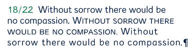
- Bad differentiation between letters and symbols that look alike, and poor differentiation between symbols in common pairings. Even for non-dyslexic readers, distinguishing between the number one, the capital letter 'i' and the lowercase 'L' can be difficult with some fonts. Dom Carter highlights this in a brilliant infographic and gives some great examples about what key features help make an accessibile font.
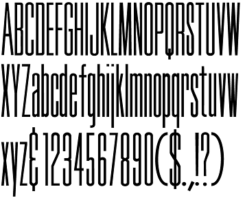
- Fonts with small bodies and large ascenders and descenders are considered bad, because the characters tend towards looking too similar to each other. A good (or bad, depending on your view) example would be the Tall Skinny Condensed font.
- Letters that just look like flipped or mirrored versions of each other with no unique feature (e.g. 'b' and 'd') can be confused easily.
- Overly tight letter spacing and kerning can prevent words being easily identified because their shape is too different
- Overly loose or wide spacing and kerning can slow a reader down, especially with longer words because the letters don't naturally appear to form words
There are lots of fonts which resolve most or all of these issues, but I'm going to focus mostly on fonts created specifically to help sufferers, along with common system fonts that have been highlighted as being particularly helpful.
Good Fonts for Dyslexia Sufferers
There are a few choices to make when deciding on a font:
- Paid or free? Is it worth spending money on a font if you don't believe there's enough empirical evidence on whether these fonts are actually that beneficial?
- Do you want to use fonts available as popular web-safe fonts?
- Do you want a clean sans-serif font, or something more comical and light-hearted?
Available Fonts
Read Regular
This was designed by Natascha Frensch in 2003 specifically for dyslexia. The idea was to create a font where each character was unique, not just a series of subtle variations on a common theme as a lot of other popular fonts are.
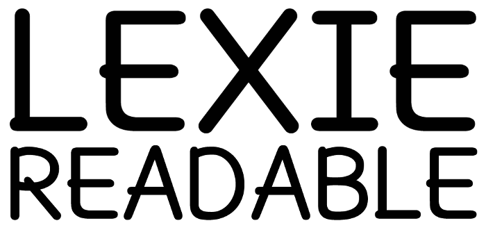
Lexie Readable
A Comic Sans like font designed to aid readability for users of all types. It's available free for personal use, and commercial use requires a license.
Open Dyslexic Font
An open-source font that uses irregular strokes to create each character. The font covers the Latin (including extended and supplemental) blocks, along with basic punctuation and some symbols.

Popular System Fonts
Various system fonts, although they're not specifically aimed at being for dyslexia, have been shown to have a benefit:
- Calibri
- Century Gothic
- Comic Sans
- Myriad Pro
- Sassoon
These are typically found on Windows, but other operating systems have equivalents which are quite similar in appearance.
Available Fonts Overview
| Font Name | Cost | More Details | Considered Web Safe? |
|---|---|---|---|
| Century Gothic | From £36, but available on some systems directly without embedding yourself | Century Gothic details | Not really |
| Comic Sans | From £43, but available on most systems directly without embedding yourself | Comic Sans details | Yes |
| Lexie Readable | Free for personal use, £15+ for commercial use | Lexie Readable details | No |
| Myriad Pro | From £30, but available on some systems | Myriad Pro details | No |
| Open Dyslexic | Open Source | Open Dyslexic details | No |
| Calibri | From £43, but available on most systems directly without embedding yourself | Calibri details | No |
| Read Regular | Publisher only | Read Regular details | No |
| Sassoon | From £47, but available on most systems directly without embedding yourself | Sassoon details | No |
It should be obvious, but possibly worth noting; the system fonts listed here are specific to Windows (I could not find details on non-Windows default system fonts that were beneficial for dyslexics), which shouldn't be relied upon as being always available. With more and more visitors to websites using mobiles, tablets, and other operating systems, relying on any font provided solely by a single OS is not generally a good idea, as it's almost impossible to guarantee what a user will be visiting from.
What the system fonts list can do though is help towards generating your list of fallback fonts, in the case that your web font isn't available.
Other Usability Tips
While changing the font can have an impact for a lot of users, there are still some things that can be done to further build on that, typical accessibility techniques that cover a lot of issues and disabilities.
- Limit total number of fonts on the page. Too many fonts can create a confusing layout, which can lead to a user being distracted easily. They also affect the total page size, which will have an impact for all of your website visitors.
- Create good colour contrast. This makes text more easily readable, even for people with vision in the normal range.
- Pay attention to font size and weight, some fonts behave terribly at smaller sizes, so increasing weight at smaller sizes can improve readability.
- Avoid blinking and moving text, this can be hard to read.
- Don't use the fonts appearance to convey meaning. Ever received an email with a misplaced capital J in the text? That's Outlook using a symbol font to display a smiling face. If you change the font, or don't have it installed, it shows the letter J. This is a bad implementation by Microsoft, the legacy of which we'll be dealing with for years.
Conclusion
So how can this help our design decisions? I wouldn't recommend completely discarding your traditional font stack in favour of one of these fonts, but you could offer it as a font choice through an alternative stylesheet on your website. This is a feature that most modern web browsers make available but is rarely used, but this would be a great reason to use them.
While the cost of some of these fonts make web usage unfeasible, they are well suited to print, so PDF files and other printed content could benefit from these while keeping the costs down.
Even if you forgo using specific fonts, the other usability tips are useful for all visitors, and can prove beneficial to a much larger audience.
I think a key takeaway from this is to ensure typography is a first class citizen on any web build.
Comments