Tags:
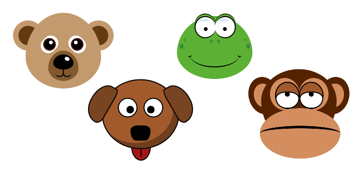
I enjoy playing around with CSS and using it for more than just styling traditional web pages. It lead me to experiment by making a few animals using no more than a handful of HTML tags.
At the core of each is the main containing <div> tag, this operates as the face and the container for the other elements. They generally have the same kind of round shape, which is all just achieved with border-radius. I used the longer syntax which puts the radius around an elliptical arc (more information at https://developer.mozilla.org/en/docs/Web/CSS/border-radius?v=control).
.bear
{
	background-color: #c39a6e;
	border-radius: 60% / 70% 70% 50% 50%;
	height: 300px;
	margin: 2em 5em;
	position: relative;
	width: 300px;
}
The ears (for those that have them) are pseudo elements positioned left and right of the head and given a negative z-index to appear behind. The colouring is done with simple radial gradients with 2 colours and 4 stop points. This gives the effect of the ears being made of multiple elements stacked on top of each other. The end result is rotated as needed for each side.
.monkey::before
{
	background: radial-gradient(ellipse at center, #d38d5f 0%,#d38d5f 45%,#520 46%,#520 100%);
	border-radius: 50%;
	content: "";
	display: block;
	height: 150px;
	left: -50px;
	position: absolute;
	top: 30px;
	transform: rotate(-15deg);
	width: 120px;
	z-index: -1;
}
The next part was eyes. Because most of the eyes were quite complicated, I used a <div> tag for each, with the first of the pair being the left eye, and the second being the right and given an extra class of right to override the positional attributes as necessary. Typically, each eye uses border-radius for the curvature and :after for the pupils. For the animals that required it, the :beforepseudo-element handles things like the iris, or highlights on the eye. The bear and monkey also use a CSS box-shadow to achieve the fur colouring around the eye, and the frog uses it for the eyelids.
.frog .eye
{
	position: absolute;
	left: 70px;
	background-color: #fff;
	width: 80px;
	height: 80px;
	border-radius: 50%;

	border-style: solid;
	border-color: #000;
	border-top-width: 4px;
	border-right-width: 0px;
	border-bottom-width: 4px;
	border-left-width: 4px;

	box-shadow: 0px -7px 0px 0px #5cb134, 0px -10px 0px 0px #000;
}
.frog .eye:before
{
	content: "";
	display: block;
	width: 40px;
	height: 10px;
	margin: 2em 5em;
	background-color: #cdecf5;
	position: absolute;
	top: -25px;
	left: -50px;

	border-radius: 60% / 70% 70% 50% 50%;
}
.frog .eye:after
{
	content: "";
	display: block;
	width: 15px;
	height: 15px;
	background-color: #000;
	border-radius: 50%;
	position: absolute;
	left: 50%;
	top: 50%;
	margin-left: -7.5px;
}
The rest of the animal features are all a mixture of border-radius, box-shadow, and pseudo-elements.
As you can see, CSS is more powerful and fun than just using it for the typical corporate website, it's an art medium in its own right. The techniques here are very simple, and with a little effort, you could even reduce down the number of HTML tags being used, or add some simple animation to add some life to the animals. The possibilities are virtually endless, limited more by your imagination more than any need to know the deep quirks of CSS.
Comments