Tags:
We've been a little over 2 years now with Covid in our lives, but there's still so much we don't know about it. One aspect of that is what the enduring effects of it are for some people, or Long-Covid as it is known. These effects vary in their symptoms and severity, but they can have an impact on our lives and can prevent us from doing all the things we are used to.
Contents
How Many People are Affected?
The Office of National Statistics has this to say:
An estimated 1.3 million people living in private households in the UK (2.1% of the population) were experiencing self-reported long COVID
Given that this is all self-reported statistics, the actual number is likely to be larger, although it's impossible to really say by how much.
Long Covid Symptoms
Of those that reported having long lasting symptoms after having Covid, the main ones that might have an impact on how people are able to use the web are:
- fatigue
- problems with memory and concentration ("brain fog")
- difficulty sleeping (insomnia)
- dizziness
- joint pain
- tinnitus, earaches
These symptoms can translate into the following main accessibility issues for people:
- Problems with concentration, which makes long or ccomplex user journeys difficult
- Problems remembering non-obvious things, such as entries on a previous form screen
- Difficulty with designs that might trigger dizziness, causing people to completely avoid or drop out from some online tasks
- Pain using a traditional mouse or keyboard to navigate
- Innability to listen to any audio, such as people speaking on a video
While these cognition related problems have always been accessibility barriers, they tend to be the least considered when working to make websites more accessible. Even looking over the WCAG 2.2 Guidelines you can see that most of the focus is visual, auditory, and motor problems. Also, it's a common enough misconception that accessibility is only for blind users that it's made the list of top accessibility myths. This is only further impacted by automated accessibility tests for cognitive issues being few and far between. It's a lot more difficult for a computer to determine how easy something is to use, or how much a user journey relies on a user remembering things. Far easier to detect missing text for an image, or a missing label on a checkbox.
The recent and sudden influx of people with these problems is highlighting the need to focus more on the cognitive impact of websites on individuals. Personally, I've found post-covid brain fog to be incredibly difficult to work with, and I'm finding myself having to take more time on a given task than I would have previously. While I am able to fully continue in my work with this, there are many people who are in a far worse situation, people who have had to take a step back from their normal roles and responsibilities. According to a report by The Lancet, 88% of people who report Long Covid symptoms have listed brain fog as a symptom.
How Can We Address This?
Up until now, cognitive issues have generally been addressed less than others, so the obvious thing to do would be to consider these types of issues more. Given that automated tests, like those found in Lighthouse or aXe, are less capable of finding these problems, it will require a little more in the way of manual testing to discover and resolve problems like these:
Simplify Forms
The large majority of forms online are already pretty simple, like a login, or a search. Sometimes though, you need to collect a lot of data. Consider a form for applying for a job. Instead of one giant form, break it into smaller logical steps, and show the user where they are within that series of steps. Use clear input labelling, and highlight errors and supply error messages close to their respective fields to allow people to more easily understand what parts may need fixing.
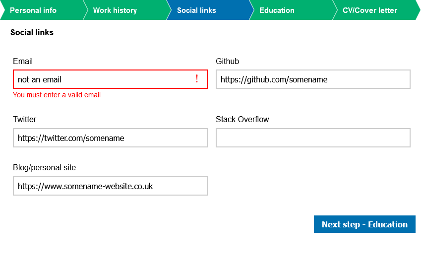
For your users who might be easily distracted, they can easily come back to this form and see what the current state is. They're reminded of what is required, and what they've already done, and anything that needs their immediate attention is made more obvious.
Besides the visuals, there are other things going on that benefit those users who also rely on their screen readers (or similar) to navigate:
- The ribbon is a series of links with the current one indicated using
aria-current="step", allowing navigation between the steps. - Input fields with errors use the actual
invalidstate, not just a CSS class. They're also associated with their visible error messages usingaria-describedby. Without that, these error messages might easily be completely missed by a screen reader. - Input labels are always visible. This means someone can start writing, go away from their computer, and still complete it correctly when they return. This is not possible with placeholder text.
- Labels are properly associated with their fields, it's not just visually nearby text.
- The collection of form fields for each section are grouped within a
<fieldset>and the heading text becomes its<legend>. This means that they can be more easily navigated using assistive technology.
Make Designs Cleaner
Visually busy designs can make it more difficult for people to hone in on the specific things they need to complete a given task. Consider the often used Lings Cars as an example of exactly what not to do:

There's so much going on with this design, it's incredibly difficult to navigate even if you're not in a distracted or confused state. There are multiple designs of navigation, as well as elements which look like they should be links but aren't. The background is incredibly busy and the lines of it make it difficult to focus on content. The large clash of colours and fonts make reading more difficult, especially if you have eyesight issues or you're in bad lighting conditions, and the sheer number of animations are an assault on our focus.
A cleaner and simpler design makes it easier for all of your users to find the content they need more quickly, but it can be especially beneficial to anyone who is already struggling. A good, but limited, font selection can help separate headings from body text.
Rely on Traditional Navigation
Navigation is one of the fundamentals of the web that Tim Berners Lee had in mind when he created the World Wide Web, the ability to link from one page to another. In the years since its inception navigation has become more complex, but at its heart it remains true to its core.
As the web has grown, it's allowed us to do more and more with how we present our navigation. We can build dynamic radial menus that break the typical box-like structure that plagues the Web, or even the website accompanying the most recent version of The Witcher TV series which uses scroll-jacking to navigate between sections.
But, this introduces a new set of problems for users who rely on the familiar. Now they have to learn how to use this new type of navigation as well as continue on with the task they wanted to complete on your site. While it might seem trivial to use a new form of website navigation, but for people affected by things like Covid brain fog.
There are many different studies and opinions about how long a person takes to come to a decision on whether to remain on your site or leave, with anything from a few seconds right up to 15. One fact remains in all of this though: people will form an opinion, and they will leave if your website is not easy enough for them to use and they feel they can get the same information elsewhere.
There's a content pattern referred to as the 'F-shape' which came from a study from the Nielson Normal Group. This shape typically covers the key content and navigation of the website if it follows a traditional approach. Because we're almost trained to expect this pattern, relying on it to build your navigation can greatly improve the time needed for anyone to find what they're looking for.
Make Text Easier to Read
The average reading age in the UK is estimated to be about that of a 9 year old, which means that if you want to maximise the audience for your content, you need to make it readable for a 9 year old.
This can be difficult or impossible for some types of content, but we should aim to use the simplest language for our audience. This means avoiding complex words or phrasing if it's not completely necessary, and you should try to use language that's simpler to read. There is a test which can give you an estimate about the reading age of your content called a Flesch-Kinkaid test. The exact formula for this is:
This live test is specifically for English content, but there is ongoing work to test the readability of other languages:
- Very easy to read. Easily understood by an average 11-year-old student.
- Easy to read. Conversational English for consumers.
- Fairly easy to read.
- Plain English. Easily understood by 13- to 15-year-old students.
- Fairly difficult to read.
- Difficult to read.
- Very difficult to read. Best understood by university graduates.
I did a fuller write-up of this test, along with the Javascript source code I wrote the live test in on my blog.
Consider How Your Content Can Be Translated
The mothertongue language of your users might not always be the same language that your websites content is written in. Under normal circumstances this can be a problem; they will either be translating it themselves if they know the language, or they will be relying on automated translations and trying to fill the gaps (automated services are good, but not perfect.) If people are then further impacted by Covid brain fog, they might be struggling far more to understand your websites content.
You could look at your visitor tracking/logs to see where people are coming from, and use that to make an educated guess about what languages you should offer translations. For example, if you notice a lot of visitors coming from Switzerland, then you might opt to add translations in German and French to make your content more available to the majority of your Swiss audience.
However, getting your content translated like this is not cheap, and might not be a cost-effective option for you, so you may have to rely on a browser offering automatic translations in the visitors preferred locale. A lot of these tools struggle with translating content that is in certain attributes in the HMTL tags, meaning the content ends up being presented to them in different languages, unexpectedly.
Some things you can do to help avoid this:
- Avoid using the
placeholderattribute for form fields. Instead, use visible labels using the<label>tag. - Use
aria-labelledbyto refer to existing page elements rather thanaria-label, which some translation tools don't properly detect. - Mark up the content language for your page, and any places where it changes using the
langattribute. This helps automatic translators get their translations correct. They might try to guess but get it wrong, which could make their translations incorrect.
Conclusion
The problems I've highlighted here are by no means new, they have always been issues to think about and address. I do believe that these issues tend to feature lower down on the list of efforts. The way that Covid has left some people should be cause to rethink on the priority of some of our accessibility efforts, and ensure we consider the whole sprectrum of barriers that people can encounter on the Web.
Comments