
Tags:
I'm often asked for a list of "quick wins" to make websites more accessible. While I don't always agree with that mindset as it can lead to a lazy approach to accessibility that's tacked on as an afterthought, I do understand that there is a real need for simple solutions that can fix the majority of problems.
Imagine the situation (and I really do believe this is a typical scenario from my experience so far) that a business has a website built already. Their dev team is fairly small, and team members are often required to multi-skill heavily across areas they have little experience in. In a team like this, finding someone who's knowledgeable about accessibility becomes less likely.
Suddenly, complaints are coming in that people are finding it difficult or impossible to use. You don't have the skills in-house to fix it quickly, so what can you do? You're in a bind, and you need some quick solutions that your team can implement right now.
Of course, there are no guaranteed fixes that will work for everyone and every situation, but hopefully the ideas I've laid out here will be of help, and should get you thinking more about accessibility in the future.
Have a look at your current site (use automated tools if you wish, but remember that they cannot detect all issues) and try to get an idea what problems you currently have. The 10 points outlined below are what I've seen as being the most common issues.
- 1. Fix Your Page Layout
- 2. Alternate Text
- 3. Colour Contrast
- 4. Text Size
- 5. Don't Use Only Colours as an Identifier
- 6. Animations
- 7. Allow Non-Mouse Navigation
- 8. Form Labels & Placeholder Text
- 9. Meaningful Link Text
- 10. Focus Styles
- Conclusion
1. Fix Your Page Layout
A lot of assistive tech makes use of what are called landmark areas which allow them to jump easily to areas on the page, like navigation blocks, forms, and other content areas.
What is less obvious is that a lot of this comes free when you use semantic markup:
- Use the right heading levels for the page. Headings should start at
<h1>and not jump levels for visual purposes only. Your heading levels will look like 1 2 3 2 2, and not 1 3 4 2 5 - Block out your main page sections with
<header>,<main>, and<footer> - Make use of
<section>and elements instead of<div> - Group together links in
<nav>elements - All form elements should belong to a
<form>, and using<fieldset>can help group together form elements.This is very useful visually as well, because it allows you to more easily break longer forms into more manageble chunks. Imagine a job application website. It would make sense to organise your details, education, work experience, etc into separate
<fieldset>blocks. You could then decide to split them visually into tabs, for example?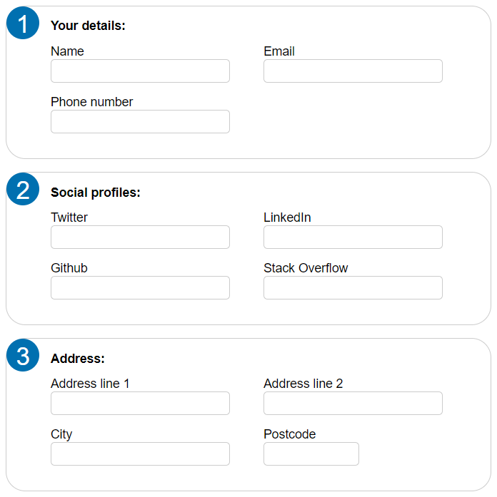
This is produced from very simple and clean HTML:
<form>
    <fieldset>
        <legend>Your details:</legend>

        <label>Name <input type="text"></label>
        <label>Email <input type="email"></label>
        <label>Phone number <input type="text"></label>
    </fieldset>

    <fieldset>
        <legend>Social profiles:</legend>

        <label>Twitter <input type="url"></label>
        <label>LinkedIn <input type="url"></label>
        <label>Github <input type="url"></label>
        <label>Stack Overflow <input type="url"></label>
    </fieldset>

    <fieldset>
        <legend>Address:</legend>

        <label>Address line 1 <input type="text"></label>
        <label>Address line 2 <input type="text"></label>
        <label>City <input type="text"></label>
        <label>Postcode <input type="text" class="small"></label>
    </fieldset>
</form>
Beyond this, you can use the role attribute on any element to give the browser better direction about what an element is, and how it should present it to the user through the accessibility tree. This can be useful to identify landmarks on the page that aren't obvious enough through the HTML markup itself
If your code is full of dozens of nested <div> tags then it's probably a sign that you're in need of more symantic markup.
2. Alternate Text
Alternate text for visual elements benefit more than just blind people. Anyone on a slow connection, or a metered data plan can benefit, because they'll still have some useful text-based content available before images load (if they do at all.)
The obvious area for alternate text is with images, and this will probably be the biggest use-case for most people. There are a few things to consider though before adding text to every images alt attribute:
- Avoid the use of the word "photo" or "image" in the description, the screen reader will already be telling the visitor this
-
Don't repeat text that is already adjacent to the image. So don't do this:
<p>Graph showing my favourite pies over the year<p>
<img src="pies.png" alt="Graph showing my favourite pies over the year"/>
But do something like this instead:
<p>Photo of my cat<p> <img src="cat.jpg" alt="Ginger cat playing with a toy ball whilst on his back"/> - If an image is a word logo, or stylised text, the
alttext should be just that text - An image that has no purpose in the content and would be otherwise given an empty
altis a great candidate for removing from the DOM and having as a background image instead.
Video and Audio
Alternate text doesn't just apply to images though. If you have any kind of audio or video content then consider the following:
- If you're not already, try moving the media content to the native HTML5
<audio>and<video>elements, as you get a lot of native accessibility out of the box. - Use the
<source>element to add captions, descriptions, etc. These use the WebVTT format to markup text content to specific time codes against a video or audio track. - Don't have audio and video autoplay on the page. Moving elements on a page can be a huge visual distraction for some people, and in some cases (like photosensitive epilepsy) can be the cause of fits and seizures. Audio too can cause distress for someone with Autism if it beings playing unexpectedly. Try to only have media like this play by a user-initiated action.
3. Colour Contrast
Visual disabilities are often more nuanced than being able to see or not. Some people can see, but struggle in low light conditions, others might not be able to see the colour red very well.
For this reason, it's important to get your colour contrast ratios right. This will mostly be for your text content, to ensure it contrasts well enough against the background it's on to still be legible for most people.
The colour contrast checker from the W3C is a great resource for this. It breaks down contrast for regular and large (bold and 14pt or larger, or 18pt or larger) text and gives a score that corresponds to the level of conformance.
While this does mainly apply to text, it's worth bearing it in mind for things like graphs and charts on the web. You should try to also use colours there that contrast well enough with the background.
4. Text Size
This ties in very closely to the previous part. There is not an official minimum size, and there are slightly different views on what a good minimum size should be. The ADA recommends at least 16px for the body text. However, it is more common to have a body text size that is slightly smaller than this. In these situations, your users may zoom into the page, or have a minimum font size set in their browser, so have a look at your site to ensure the design doesn't break under reasonable conditions.
5. Don't Use Only Colours as an Identifier
It's very common to use only colour as a means of identifying certain types of information. Graphs and charts are a very common example, but even things like on/off toggle switches can cause problems for a person who can't perceive colours or is relying on a screen reader for information.
Graphs Using Only Colours for Identification
Consider the following line graph which uses colours to link the key with the lines on the graph:
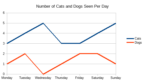
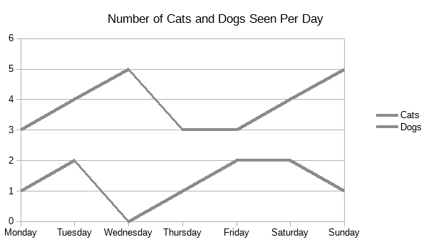
Now image a person looking at this who is unable to perceive the red colour:
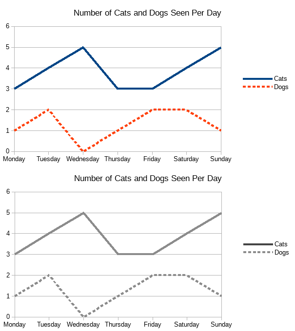
However, that same graph can be made more accessible by changing the stroke on the lines:
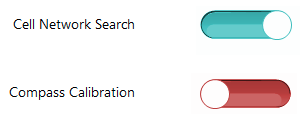
Toggle switches are another example that typically rely only on colour to signify their state, but by adding a visual label to their state, they're much easier to understand:
Toggle Buttons Using Only Colours for States
Another example I've used in presentations before is that of toggle buttons. By default, most design systems that include styles for toggle buttons rely solely on colour to indicate their on/off state. If someone is unable to distinguish those colours, then they will have to spend more time thinking about the interface and trying to understand what "on" and "off" states look like.
This is a fairly typical example of a couple of toggle buttons on a mobile phone. If you can see in colour, you can easily tell which one is currently "on" of the two.
However, for someone who suffers from Achromatopsia (full colour blindness) the toggles will look a bit like this:
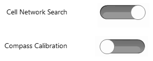
Now it takes a bit more time to identify which is "on". You have to think about the placement of the circle within the toggle slider area. For anyone who isn't so familiar with toggle buttons, this is made even more difficult.
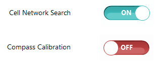
A simple addition of their state as text makes them much more accessible for everyone:
6. Animations
People who suffer from Autism or ADHD (among others) can sometimes find animations on the web distraction, disorientating, and find it very difficult to carry out the task they were trying to achieve.
There are even some people who find animations so incredibly awful and actually induce physical symptoms of illness. Facundo Corradini wrote a wonderful piece about how animations affected his computer use because of his temporary vestibular (inner ear) problem.
If you're including animation in your website, then give people the opportunity to turn them off. The best way is via the prefers-reduced-motion media query:
CSS Animations
@media (prefers-reduced-motion: reduce) {
    animation: none;
}
Autoplay Videos
If the animation is an autoplay video, then disable autoplay; let your users decide when they want to play videos, and give them control over what plays and when.
Animated GIFs
There's a nice trick to using the prefers-reduced-motion query to replace animated GIFs with static images:
<picture>
    <source srcset="static.jpg" media="(prefers-reduced-motion: reduce)"></source>
    <img srcset="animated.gif"/>
</picture>
That's it! Out of the box you can automatically swap out animated images for their still counterparts, and no JavaScript needed.
7. Allow Non-Mouse Navigation
People will not always be using a mouse for navigation. Sometimes this is because they cannot, sometimes it's because they choose not to.
For example, older people, or those suffering from Parkinson's or other muscular issues may not have the fine motor skills required to move their mouse cursor and interact with small buttons and links on the screen. It also makes it difficult to interact with multi-level dropdown menus that require a very thin margin of mouse control to use:
Hover States and Timeouts

If you have menus or other components like this that require someone to hover their mouse and move in a very specific direction or pattern, look at changing the area that they need to move within to access the menu as Chris Coyier outlines in a blog post.
Keyboard Access
At the very least, ensure that everything can be accessed via a keyboard. Now, if you're using semantic markup, the interactive elements of your pages should already have fairly good keyboard access already. Some complex elements however, will need to use a combination of existing HTML elements in order to function. Consider the above drop down menu again.
The WAI has a great article on making an accessible menu like this, using the aria-haspopup and aria-expanded attributes to indicate the presence of the menu and its state. It also details how to use Javascript to capture click events (browser will also trigger click events when pressing enter or space on certain elements) to toggle the sub-menu.
Touch Interaction
More and more these days, touch interaction is becoming the more common method of navigating the web, mainly because of the huge proliferation of mobile phones and tablet devices out there.
However, it's important to remember that screen size doesn't have a direct relationship to whether someone is using a touchscreen or not.
-
Desktops and laptops are more frequently found with touchscreens, so it's important to ensure that surface areas for buttons is large enough and has adequate space that they won't be accidentally touching things they didn't intend.
The new Gov.UK Design System goes into a lot of detail about the sizes of elements and details how to go about styling your markup to make it more accessible.
-
Mobiles and tablets can have mice and keyboards too. A fun trick (I'm really fun at parties) is to plug a USB mouse and keyboard directly into my Android phone. Immediately you are presented with a mouse cursor and you can type and use the keyboard just as if you were on a desktop. If you think this is such an unusual and extreme example, imagine the scenario with a tablet computer, plugged into a dock and an external screen.
What you should take away from this is to allow people to navigate fully and use every feature of your website using keyboard, mouse, and touch; all of them together, just one, or a combination of any two.
8. Form Labels & Placeholder Text
Forms on the Web are horrible, and some elements are almost impossible to coerce into a good looking state. In our attempts at making them look nicer, we often make them less accessible.
There are some things we can do to help ensure that the forms will still function for all of our users though:
-
Every form element should have a
<label>. The only exception are buttons. That means an individual label for every text field, checkbox, and radio button.This is vitally important not only for screen readers, everyone will benefit from a clearly labelled form. Your visitors may be fully-abled, but are juggling working from home with looking after children and they've not had enough sleep for days.
If you're unable to add a
<label>tag for some reason, then you can usearia-labelandaria-labelledbyto help add an accessible label. However, this will mean that people not relying on accessible tech like a screen reader may well be left with a poor user experience. - Placeholder text on form elements is _not_ a substitution for a
<label>. Screen readers and similar tech doesn't use placeholder text as a label that it associates with an element, and colour contrast of the text itself is usually quite low and can cause problems for anyone with low vision. -
Associate error messages and instructions with the field they belong to. For example:
<div class="error" id="credit-card-error">Credit card number appears invalid</div>

<input type="text" name="credit-card" aria-describedby="credit-card-error credit-card-instructions"/>

<div id="credit-card-instructions">Credit card number should not contain spaces</div>
If a user is relying on a screen reader, this markup will indicate to them that this field has some more details, and allow them to choose to have them read out.
-
Ensure that text fields look like text fields. A common anti-pattern found in Bootstraps Material Design documentation is to remove the border on the field, set it's background to transparent, and move the label over the top to look like a placeholder.
These do not look like traditional form fields, and so can be hard to identify. They fail colour contrast guidelines as well, and the single bottom border is not enough for some people to indicate that this is an interactive form element.
9. Meaningful Link Text
A lot of screen readers allow people to jump to various parts of the page (landmarks), in the same sort of way that a person who has no eyesight problems can dart their eyes all over their screen to focus on interesting parts.
What this means is that links can sometimes be presented out of context of the surrounding content. So things like the following are bad practice:
<p><a href="news.pdf">Click here</a> to download our monthly newsletter</p>

...

<p>Click the button below to start the quiz</p>
<a href="quiz.html">Start</a>

...

<h2>Search Results</h2>
<p>Page:</p>
<a href="search?p=1">1</a>
<a href="search?p=2">2</a>
<a href="search?p=3">3</a>
<a href="search?p=4">4</a>
When those links are read out of context, they make no sense, and your user is left confused. Now they have to step out of the list of links to understand what each one is about, creating a bad user journey.
Instead, you could do something like this for each of them:
<p><a href="news.pdf">Download our monthly newsletter</a></p>

...

<p>Click the Start quiz" button below to start the quiz</p>
<a href="quiz.html">Start quiz</a>

...

<h2>Search Results</h2>
<p>Page:</p>
<nav aria-label="Search results pagination navigation">
    <ul>
        <li><a href="search?p=1" aria-label="Page 1" aria-current="page">1</a></li>
        <li><a href="search?p=2" aria-label="Page 2">2</a></li>
        <li><a href="search?p=3" aria-label="Page 3">3</a></li>
        <li><a href="search?p=4" aria-label="Page 4">4</a></li>
    </ul>
</nav>
The last example is a bit more complex so I'll explain in more detail what's happening. Firstly, the links are wrapped in a list, and then wrapped in a <nav> element. This lets the browser know that this is a list of navigation links, and it lets screen readers present them to the user in different ways.
I've left the text of each link the same, but added an aria-label. This is something that is only seen by screen readers (and similar tech), so visually it can remain the same, but now when the links are read out, they make sense.
Finally, I've added an aria-current="page" onto the active results page. This is best practice with navigational links; it's the accessible equivalent of class="active" that is seen on navigation lists like this, and you can use CSS to style it directly, e.g.:
a[aria-current="page"] {
    font-weight: bold;
}
10. Focus Styles
Everything that can receive input should have a focus style to indicate to the user where they are within your website.
A common request from designers is to completely remove the "ugly" focus styles from links and buttons, because they spoil their beautifully crafted design. Please don't ever do this.
Focus styles help a lot of different types of people, such as those who don't use a mouse and have to rely on visuals as they tab around the page, or users who have just come back from making a cup of tea and need prompting about where they were before their break.
Generally, you can leave the styles in that the browser has already got built-in. These are familiar to the user, and require less re-learning for them.
However, if you do need to change them to meet an aesthetic standard, then ensure that the new styles:
- Keep a decent level of contrast with the background, or indicate well enough without colour what element on the page currently has focus
- Don't try to get clever and only highlight focused items when a keyboard tab is detected.
-
If you override the focus styles to use box shadow instead of an outline or border, bear in mind that `box-shadow` styles are completely dropped in Windows High Contrast mode. Instead, you can do something like this:
*:focus {
    box-shadow: 0 0 5px #0070b0;
    outline: 2px solid transparent;
}
By giving the focused element a transparent outline, nothign is shown, _until_ the user switched to High Contrast mode. Then, the shadow is dropped, and borders and outlines are shown using the foreground colour for that element. Also, because it's an outline, it won't cause elements on the page to re-flow, so you don't have to mess with swapping between borders and margins.
Conclusion
The power of the Web is in its universality. Access by everyone regardless of disability is an essential aspect.Tim Berners-Lee, W3C Director and inventor of the World Wide Web
Accessibility isn't just for people with disabilities. While that might be the largest target demographic for Web accessability improvements, the curb effect shows that these changes will most likely benefit everyone.
Adding captions to your videos means that someone who forgot their headphones can still enjoy your video while on a busy train. Improving the contrast of text against the background means that someone can more easily read through your site in their sunny garden.
Keep that in mind when you're making accessibility changes to existing code. What perhaps seems like a small change that may only affect 5% of your visitors, it might very well end up improving the experience for 85% instead.
Comments