
Tags:
For many years, tables were the only tool available to lay out our websites as we wanted to achieve something that went beyond what you'd probably come to expect with your typical word-processed documents. Then for the last decade (or so) we were told that tables were evil, and using them was a sin that would earn us a spot in the 6th circle of IT hell. More recently we've learned that that anti-table over-zealousness was actually too extreme, and that tables are actually okay for tabular data (no, not you emails, you are firmly stuck in IT hell).
Contents
- What Makes a Data Table
- The Basic Table
- Tables with Multiple Levels of Headings
- Tables with Grouped Headings
- More Complicated Multi-Heading Tables
- Overriding Default Table Styling
- Visual Changes for Accessibility
- References
What Makes a Data Table
Usually it's obvious what is tabular data and what could be better expressed with other, more semantic, markup. However, sometimes this isn't as cut and dried as it might initially seem, with quite some debate about definition lists Vs tables or whether to use regular lists or even headings for different data types.
I had to answer this question myself recently when working on updating the HTML for a file list. Despite the name, I still felt this was best represented as a table. The main reason for this was the 2-dimensional element to the data being displayed; there were columns of data representing file sizes, dates, and other details.
If it has clear columns of data, it's probably a table
The Basic Table
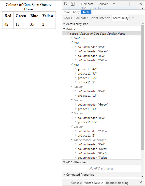
Out of the box, a simple table with only one header is pretty accessible if you mark up the header fields correctly with <th> tags. Browsers understand the intent from something so basic and are able to parse the table into the accessibility tree properly. This happens without the need for a <thead> element (as your headings might not always be as a row but a header column).
One thing that can aid accessibility and general usability of the table is to add a caption. This helps when the table is read out of context from the surrounding contents of the page (which may happen with some screen readers). By adding a caption, the table can contain all the information it needs in order for anyone to understand it. This simple table markup gives you a pretty accessible tree:
<table>>
	<caption>Colours of Cars Seen Outside House</caption>
	<tr>
		<th>Red</th>
		<th>Green</th>
		<th>Blue</th>
		<th>Yellow</th>
	</tr>
	<tr>
		<td>42</td>
		<td>13</td>
		<td>35</td>
		<td>2</td>
	</tr>
</table>
Simple Table Example
| Red | Green | Blue | Yellow |
|---|---|---|---|
| 42 | 13 | 35 | 2 |
All the information from the table is made available in a variety of different ways, allowing a user who is relying on accessible technologies to "see" the data by columns, read out only the headers, or only the values. This presents the data in much the way a fully-seeing person might view it.
Tables with Multiple Levels of Headings
When tables go beyond a single level of heading, then you may need to assist browsers in understanding your layout. The simplest, yet one of the most effective, way to do this is using the scope attribute on a header cell:
<table>
	<caption>Colours of Cars Seen</caption>
	<tr>
		<td></td>
		<th scope="col">Red</th>
		<th scope="col">Green</th>
		<th scope="col">Blue</th>
		<th scope="col">Yellow</th>
	</tr>
	<tr>
		<th scope="row">Outside house</th>
		<td>42</td>
		<td>13</td>
		<td>35</td>
		<td>2</td>
	</tr>
	<tr>
		<th scope="row">Outside work</th>
		<td>84</td>
		<td>26</td>
		<td>70</td>
		<td>4</td>
	</tr>
</table>
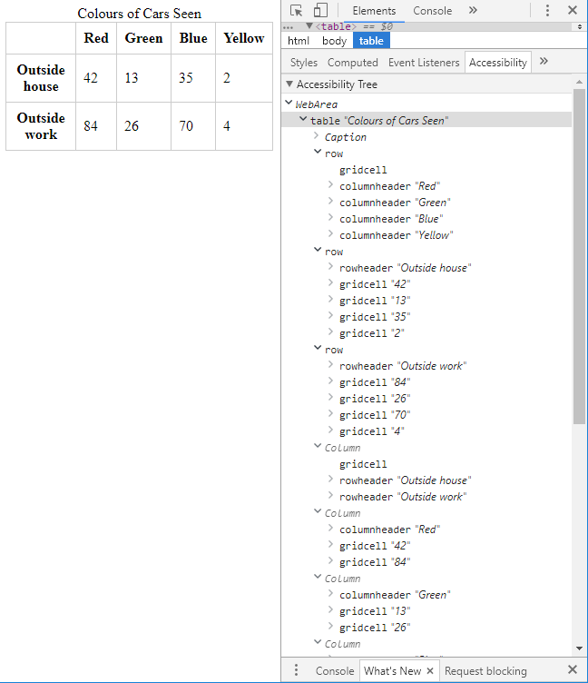
Here the tables data rows are broken down into two distinct counts, one for each location. In order to let the browser know how to handle the two sets of headings, a scope attribute has been added. These denote the column or row scope for that heading. The resulting accessibility tree looks something like this:
Multiple Headings Table Example
| Red | Green | Blue | Yellow | |
|---|---|---|---|---|
| Outside house | 42 | 13 | 35 | 2 |
| Outside work | 84 | 26 | 70 | 4 |
Tables with Grouped Headings
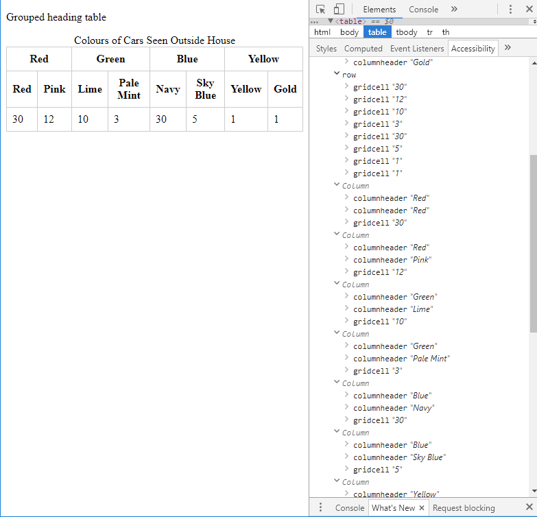
Another type of table you may wish to create is the grouped heading table. This has multiple headings, but all at the same level (e.g. both column or both row headings). For example, using the same table in the other examples, what if we wanted to be more specific about the colours while still retaining the basic shade grouping?
<table>
	<caption>Colours of Cars Seen Outside House</caption>
	<colgroup span="2"></colgroup>
	<colgroup span="2"></colgroup>
	<colgroup span="2"></colgroup>
	<colgroup span="2"></colgroup>
	<tr>
		<th colspan="2" scope="colgroup">Red</th>
		<th colspan="2" scope="colgroup">Green</th>
		<th colspan="2" scope="colgroup">Blue</th>
		<th colspan="2" scope="colgroup">Yellow</th>
	</tr>
	<tr>
		<th scope="col">Red</th>
		<th scope="col">Pink</th>
		<th scope="col">Lime</th>
		<th scope="col">Pale Mint</th>
		<th scope="col">Navy</th>
		<th scope="col">Sky Blue</th>
		<th scope="col">Yellow</th>
		<th scope="col">Gold</th>
	</tr>
	<tr>
		<td>30</td><td>12</td>
		<td>10</td><td>3</td>
		<td>30</td><td>5</td>
		<td>1</td><td>1</td>
	</tr>
</table>
Grouped Heading Table Example
| Red | Green | Blue | Yellow | ||||
|---|---|---|---|---|---|---|---|
| Red | Pink | Lime | Pale Mint | Navy | Sky Blue | Yellow | Gold |
| 30 | 12 | 10 | 3 | 30 | 5 | 1 | 1 |
The interesting part here now is how the accessibility tree in the browser has picked up the grouped headings. You can see that the Green column is listed twice, once with the Lime column header, and then again with Pale Mint. This makes sense, because those headings do belong together as linked entities.
It's worth noting at this point that these tables are very simple examples, and most modern browsers will still be able to make logical sense of them even without the accessibility attributes. The real value of the attributes is apparent when dealing with more complicated table layouts or on browsers that aren't good at guessing your intent.
More Complicated Multi-Heading Tables
When your tables need to be more complicated, then scope won't always be the ideal solution. One instance I came across for this was when I was trying to build an accessible cross-reference table. Now, the advice in that post is a little outdated, so I'll go into detail here with what's currently best practice.
<table>
	<tr>
		<td></td>
		<th id="tv_great">Great</th>
		<th id="tv_ok">It's ok</th>
		<th id="tv_awful">Awful</th>
	</tr>
	<tr>
		<th id="tv_firefly">Firefly</th>
		<td headers="tv_great tv_firefly">great</td>
		<td></td>
		<td></td>
	</tr>
	<tr>
		<th id="tv_got">Game of Thrones</th>
		<td></td>
		<td headers="tv_ok tv_got">ok</td>
		<td></td>
	</tr>
	<tr>
		<th id="tv_vikings">Vikings</th>
		<td headers="tv_great tv_vikings">great</td>
		<td></td>
		<td></td>
	</tr>
	<tr>
		<th id="tv_towie">The Only Way is Essex</th>
		<td></td>
		<td></td>
		<td headers="tv_awful tv_towie">awful</td>
	</tr>
</table>
Quite a few changes here from the original. Firstly, there are no scope attributes in use. Instead, headers have unique id values, and the headers attribute of a cell is used to reference the specific headers which are applicable. While this is less maintainable (especially for large tables), it works well for a cross-reference table as not all cells have data. The next change from my original post is to alter the text that reads 'yes' to the specific word which best describes the reference value. In this case, the adjective used to describe the TV show works perfectly. Play around with different values until you find something that makes sense within your browser accessibility tree.
Cross-Reference Table Example
| Great | It's ok | Awful | |
|---|---|---|---|
| Firefly | great | ||
| Game of Thrones | ok | ||
| Vikings | great | ||
| The Only Way is Essex | awful |
Overriding Default Table Styling
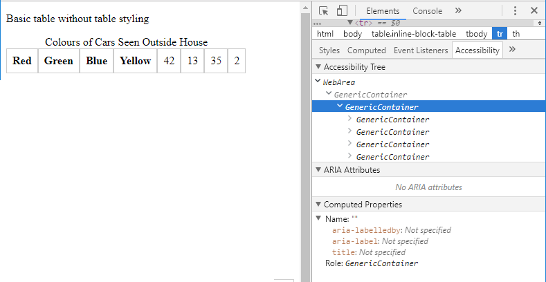
Tables aren't very responsive by their nature, and it's quite normal to hide some columns on smaller screens, or to change the layout of a table entirely to resemble something more akin to a list. In order to do this, the typical approach is to change the CSS display property to something like block or inline-block to gain more control over how the individual table cells are presented.
However, this creates a silent accessibility issue; the table loses the samentics of what it is to be a table! Obviously, this is not what we're aiming for at all, so what can be done?
Thankfully, the solution is simple, albeit ugly. Add in roles to each table element to let the browser know that it's still a table despite the unorthadox appearance. Let's go back to the first simple table example, but this time, there's some CSS which overrides the display properties:
<style>
table.inline-block-table,
table.inline-block-table tr,
table.inline-block-table td,
table.inline-block-table th
{
	display: inline-block;
}
</style>
<table class="inline-block-table">
	<caption>Colours of Cars Seen Outside House</caption>
	<tr>
		<th>Red</th>
		<th>Green</th>
		<th>Blue</th>
		<th>Yellow</th>
	</tr>
	<tr>
		<td>42</td>
		<td>13</td>
		<td>35</td>
		<td>2</td>
	</tr>
</table>
Grouped Heading Table Example
| Red | Green | Blue | Yellow |
|---|---|---|---|
| 42 | 13 | 35 | 2 |
Suddenly, all of that wonderful table information is gone from the accessibility tree, and instead it's replaced with GenericContainer. By adding roles to each element, the table gets back some of the original semantics:
<style>
table.inline-block-table,
table.inline-block-table tr,
table.inline-block-table td,
table.inline-block-table th
{
	display: inline-block;
}
</style>
<table class="inline-block-table" role="table">
	<caption>Colours of Cars Seen Outside House</caption>
	<tr role="row">
		<th role="columnheader" scope="col">Red</th>
		<th role="columnheader" scope="col">Green</th>
		<th role="columnheader" scope="col">Blue</th>
		<th role="columnheader" scope="col">Yellow</th>
	</tr>
	<tr role="row">
		<td role="cell">42</td>
		<td role="cell">13</td>
		<td role="cell">35</td>
		<td role="cell">2</td>
	</tr>
</table>
Unfortunately, Chrome seems not to correctly associate table cell data with their corresponding headings. However, this may just be a bug in the way the accessibility tree is presented in the debug tools.
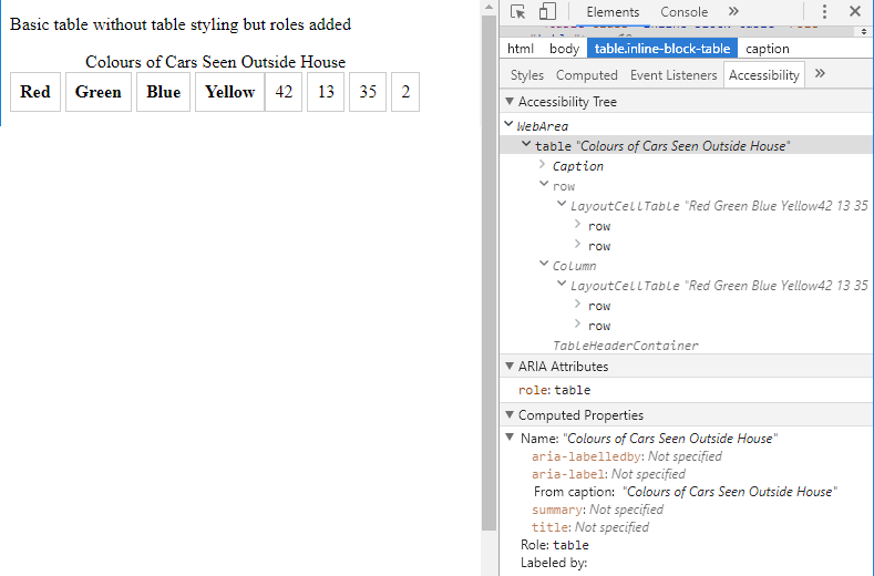
Grouped Heading Table Example
| Red | Green | Blue | Yellow |
|---|---|---|---|
| 42 | 13 | 35 | 2 |
Unless you have a good reason then to change the default table styles, try to avoid it, as the fixes aren't without problems it seems.
Visual Changes for Accessibility
Accessibility is not just about making sure that a screen reader can interpret markup and speak to a user. There are many disabilities where a person has full vision, but would still have difficulty getting the most out of your content.
Content Alignment
There's a great post on table design which has some brilliant points to make on the alignment of content within a table. It even covers the usage of different fonts for numerical data to make it easier to read. One interesting suggestion is the use of tabular (or monospaced) fonts for numbers, to aid with column alignment. Matthew also recommends the traditional advice of aligning text to the left and numbers to the right, although this tends only to be applicable to content in left-to-right language cultures.
Tables on Smaller Screens
With the proliferance of small handheld devices, it's almost a certainty that your table will be seen on a smaller screen, and tables just don't tend to be responsive by their nature. You could use CSS to alter the layout of them, but as seen above, that can introduce its own semantic accessibility problems.
Another approach is to make the table horizontally scrollable, or to replace the table entirely with an alternative content. Bear in mind that users of mobile devices don't necessarily have great dexterity, so scrolling should be easy, obvious, and intuitive.
Zebra Striping
One issue that can arise for many types of users with disabilities is a lowered ability to concentrate. This can be evident for them when browsing large, complex tables. To aid readability, you can shade alternate rows, otherwise known as zebra striping. This helps guide the eyes along a row more easily, hopefully preventing a user from losing their place as they scan the rows.
One thing to be aware of here is to avoid using colour alone to highlight a line; ensure there is still sufficient contrast. You don't have to keep to the 4.5:1 contrast ratio required for text against a background image, but using white and pale yellow will mean anyone with certain types of colour blindness (tritanopia or monochramacy) or low vision issues may not even be able to see these row differences.
References
- https://www.w3.org/WAI/tutorials/tables/tips/
- https://developer.mozilla.org/en-US/docs/Learn/HTML/Tables/Advanced
- https://webaim.org/techniques/tables/data
- https://www.w3.org/TR/2017/NOTE-wai-aria-practices-1.1-20171214/examples/table/table.html
- https://www.powermapper.com/tests/screen-readers/tables/table-role-presentation/
- https://www.w3.org/WAI/tutorials/tables/
- https://snook.ca/archives/html_and_css/definition-lists-v-tables
- http://css-discuss.incutio.com/wiki/Tables_Vs_Lists
- https://developer.paciellogroup.com/blog/2018/03/short-note-on-what-css-display-properties-do-to-table-semantics/
- https://medium.com/mission-log/design-better-data-tables-430a30a00d8c
Comments