
Tags:
If you're developing for the front end, then it's important to understand how to test that what you produce is accessible. Testing across multiple browsers has been part of front end development since the beginning; browsers would always interpret your code in slightly different ways, both small and large. Accessibility testing is no different really, you're just approaching things from a slightly different angle.
A Quick Checklist
This is the Too Long Didn't Read part; a short checklist that a developer can use to test their work:
Test with Browsers
Your browser is probably one of the most useful tools when it comes to accessibility testing, and the best thing about it is: you're already using it.
The two best tools I've found for this level of testing are built right into Chrome and Firefox. They both test for slightly different things so it's worth using them both.
Chrome's Lighthouse
The Lighthouse tool built into Chrome is available under the Audits tab of the developer tools. There are a few tests besides accessibility, such as performance and SEO. Select the required category of audit, pick the device you wish to test for, and then generate the report. This will provide you with a score ranging from 0 (the worst) through to 100 (no issues found, but this doesn't mean perfect). It's worth bearing in mind that this testing performs several refreshes of the browser window so some things might not be tested (e.g. messages based on Javascript events).
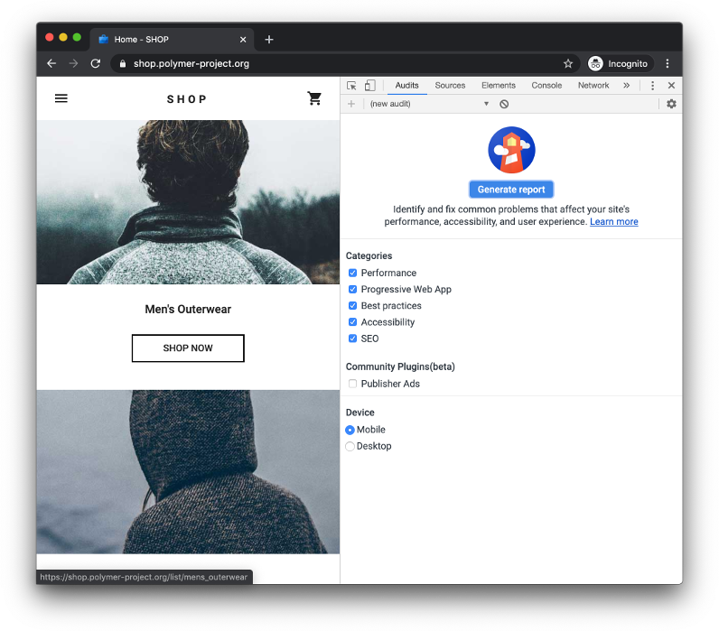
Lighthouse uses the Axe Core testing engine which is used by a lot of other testing tools, so it's got a strong well-known base.
If you're wanting to integrate this into your continuous integration pipelines then there is also the Lighthouse CLI tool. This will require you to get an API key to use it.
Firefox Accessibility Tab
The tools built into Firefox operate on the DOM as it is at the time you test, so it's especially helpful catching issues that require a user taking several steps through the UI in a way that can't easily be automated with something like Lighthouse.
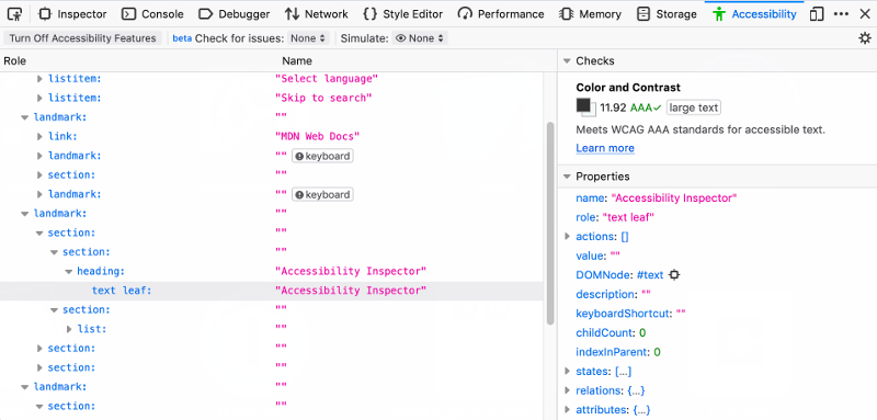
These tools have their own Accessibility tab on the developer tools. You will need to turn them on for the current browsing session, but when activated they also add an option to the context menu to inspect the accessibility properties of any visible element.
The Accessibility tab also lets you check for various kinds of issues, and run some types of colour blindness simulations on to check for obvious colour problems with the design of the website. I did notice that the simulation was not always available for all websites. I imagine that it is due to a similar kind of heuristic analysis that determines if reading mode is available within the browser.
Axe
While this is already technically covered by Lighthouse (as it's running Axe under the hood), Axe does have a CLI tool that doesn't require an API key to use, so it might be a more favourable option for your CI pipelines.
Validate Your Markup
HTML is an incredibly forgiving language, and the browser will try to compensate for all kinds of mistakes. However, while everything may appear to look perfectly fine, the way that it's all interpretted and then presented to the browsers accessibility tree (and ultimately screen readers, etc) might not be what you intended. By validating your markup you can ensure that your website will follow specified behaviour.
The W3C validator is the best tool for this by far, but if you need something that you can more easily use locally without publishing your website to a public URL then there are tools you can install locally, like html-validator-cli for Node, w3c-validator-cli for Python. The W3C does also offer the source code for their validation service as an installable tool for most major Linux distributions and Mac OSX.
Disable CSS Completely
By turning off all the styles in your website you are able to check 2 things:
- The document structure is logical and matches the visual order of the page.
- You're using the right semantic tags for the right type of content.
A Logical Document Structure
In standard reading mode (i.e. before you've begun navigating to specific parts of the page) the screen reader will read out your document in the order that the content appears within the HTML. Keeping the HTML in a logical order means that you're less likely to confuse screen reader users.
It's also not only screen reader users who will benefit from this. More and more users are taking advantage of browsers' built-in reading mode, which disables most styles, and reflects the actual content order.
Semantic Markup
Using the right tags for the right purposes will save you from doing extra work, and gives you a lot of accessibility benefits with little effort. Just something as simple as using <h*> tags for your headings means that you've given screen reader users another way to navigate your website.
An all too (unfortunately) common anti-pattern is to overuse the <div> tag for virtually everything on the page, leading to markup that looks like this:
<div class="main">
    <div class="header">
        <div class="heading">Some Heading</div>

        <div class="nav">
            <div class="nav-item"><a href="#">Link 1</a></div>
            <div class="nav-item"><a href="#">Link 2</a></div>
            <div class="nav-item"><a href="#">Link 3</a></div>
            <div class="nav-item"><a href="#">Link 4</a></div>
        </div>
    </div>
    <!-- rest of content here -->
</div>
That sort of <div> soup is a mess, and in order to make it more accessible, you'll need to liberally use role attributes just to get similar behaviour that you'd have for free with the right semantic markup:
<main aria-labelledby="main-heading">
    <header aria-labelledby="main-heading">
        <h1 id="main-heading">Some Heading</h1>

        <nav aria-label="Main nav">
            <ul>
                <li><a href="#">Link 1</a></li>
                <li><a href="#">Link 2</a></li>
                <li><a href="#">Link 3</a></li>
                <li><a href="#">Link 4</a></li>
            </ul>
        </nav>
    </header>
</main>
As well as being more obvious and easier to read for the next developer to touch the code, you get the benefit of screen readers being able to understand your content and present it to the user in a way that will make more sense. Those people can now navigate more easily with your named landmark areas.
The more complex your content, the more benefits you get. Imagine having a custom checkbox that actually doesn't use a <input> tag at all, but uses a nest of <div> tags. In order to make this work as expected for all users you need to:
- Add a
tabindexandroleto the element to ensure that it can receive focus - Add click event handlers to capture mouse (and touch) events that sets the checkbox state
- Add a key press event handler to allow
spaceandenterto toggle the state, and for the arrow keys to navigate individual checkboxes in a group - Add form submit event handlers to process each fake checkbox and handle the value that needs to be sent to the server
- Add form submit error handling code to ensure that all required fake checkboxes have been checked
- Add Javascript to reselect the users checked selections if the form submits but results in an error
- Add styles to handle checked and unchecked states (and the indeterminate state if that is something you end up using in your application)
- Add an
aria-labelso that it can be represented in the accessibility tree correctly
That's a lot of work to replicate what you get for free with <input type="checkbox">. If you're doing a lot of front end work, familiarise yourself with all of the available HTML tags.
Navigate the Website Only Using a Keyboard
You don't have to actually throw away your mouse, but put it aside, and don't use it (unless you really have to). Can you tab through all of the elements of the page that would normally respond to clicks? Most of the time, checking with the browser accessibility tools should give you an indication of elements that have Javascript click handlers and no keyboard-specific functionality, but automated tools cannot catch everything.
Marcy Sutton released a No Mouse Days npm plugin which injects some CSS into your HTML-based applications or websites to completely hide the cursor on a predefined day of the week in order to force you to forgo the mouse. If you're interested, under the hood it's injecting this:
* {
    cursor: none !important;
}

@media (pointer: fine) {
    * {
        pointer-events: none !important;
    }
}
One thing to bear in mind while performing the keyboard testing; do this without running a screen reader. This is because screen readers will also try to help out by adding in certain behaviours and mapping certain mouse-only events to their keyboard equivalents. So that element you only added a click event to will now respond to the enter and space keys as clicks too. But not all people who rely solely on keyboard navigation will be using screen readers, some may just not have the fine motor control required.
Test with Screenreaders
If you've never used one before, the first time using a screen reader can be quite disconcerting, especially if you also try to use your mouse at the same time. Most readers have several modes that they can operate it, which allow for different types of navigation beyond just tabbing through elements of the page. It's absolutely essential that you learn some of the keyboard navigation shortcuts specific to the screen reader you're testing, as this will mean you can test more like your users.
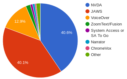
As of 2019, NVDA seems to be the most popular screen reader by a whisker, followed very close by Jaws, and between them both they account for just over 80% of screen reader usage, so test on one of those readers on the desktop if you have access to a Windows machine. NVDA is completely free to use, while Jaws has a free trial period of about a half hour once a day, which might not be enough for developer testing.
Listening to a screen reader can highlight many things which are not immediately obvious from appearance or automated scans:
- Labels
- Automated tests should highlight form elements and images that are missing alternate text labels, but they can't catch everything. If you don't hear something spoken out that you're expecting to, then you know where you need to add labels.
- Landmarks
- Landmarks are like automatic anchor points across the page. When your code is set up correctly, forms, navigation bars, sections, headers, and footers are all landmark areas, allowing someone to jump to them without tabbing through all the content between.
- Mispronounced words
- Screen readers will try their best to read what you tell them too, but sometimes there's not enough context to get it right if it's just reading a single word that is also a homograph. Sometimes it's an unusual word that doesn't follow normal language rules, or maybe it's an abbreviation or proper noun (like a brand name). Emoji and other symbols can also trip up screen readers, especially if a letter is used where a particular symbol should have been instead, such as with X and ×. There are also conventions which we might take for granted which don't work with a screen reader, like using "£5 /year" when what you really mean is "£5 per year".
Ensure Hit Areas are Large Enough
The WCAG 2.1 guidelines mentions in criterion 2.5.5 that the target size for pointer inputs should be at least 44 square pixels (albeit with some exceptions). This is listed as a AAA level guideline, which usually puts it at the back of most accessibility conformance projects, but I've always felt this level was a mistake. For those people without fine motor control, this guideline could be the difference between them being able to use your website or not.
One aspect of this is form elements, such as buttons, radio buttons, and checkboxes. Supplying visible labels for all elements goes part of the way (and missing labels should have been picked up by the browser automated tests) but there's also the percieved hitbox area for elements. People have been trained over time to not click on an elements visible label because a lot of badly built websites don't associate elements with labels correctly. The UK government website has some great guidelines on accessible form elements, which contain examples and styles of how to build form elements with larger funtional and perceived interactive areas.
High Contrast and Dark Modes
Most operating systems now offer users a way to change the colour scheme that they use, but the exact way it's done across differenet devices will vary. Most usually, these modes just alter the existing colours used, but inverting or applying a "smart" invert to the colour scheme you selected for your website.
You can alter how this is handled on your own website by applying specific colour CSS within a media query:
@media (prefers-color-scheme: dark) {
    // your dark CSS here
}
This will be especially useful when you're adjusting things like 3D appearances of buttons and cards that use shadows and colouring to give the effect of a directional light source. Just inverting colours will make it appear that the direction of light is "wrong".
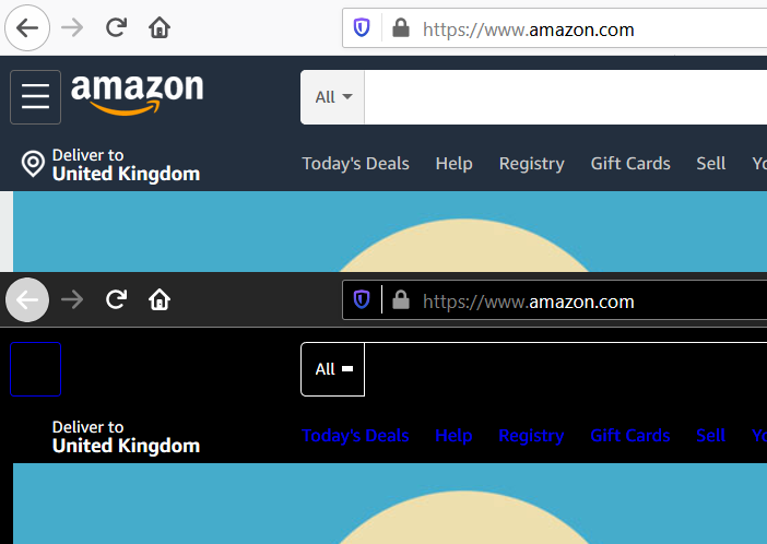
Windows High Contrast and Shadows
Not all colour modes are made equal, however. The high contrast mode in Windows goes a little bit further. It applies a reduced palette colour scheme of about 5 colours, and it applies these to all elements except images and video. Because of the reduced palette, it means that things like CSS gradients, background images, and shadows are removed.
One major issue that testing in Windows high contrast mode can show is that content generated by using borders on pseudo elements (drawing with borders and gradients is a common technique for creating some buttons ) is not visible.
However, there are a few things that you can do to mitigate these problems:
- Use SVG images instead of using
:beforeand:afterpseudo elements and borders to draw in pure CSS. - Instead of setting the
fillcolour property directly to the colour value, use the following:svg { colour: #bada55; fill: currentColor; }This lets the SVG take on the foreground colour when high contrast mode is active. - If you're using
box-shadowto style something like the:hoveror:focusstates, set a transparent border or outline also. When high contrast mode is active, the shadow is removed, but the colour of the border will be changed to the foreground colour at the thickness you specified:a:focus { box-shadow: 0 0 3px 1px #0070b0; outline: 2px solid transparent; } - If an image is essential to the content, then it should use an
<img>tag, don't make it a background image. This way, you can easily get the benefits of alternative textual content for that image without having to mess with variousaria-*attributes and "clever" CSS tricks. After all,alttext is not just for screen readers, it's what a user sees before that image loads (if it does at all).
Conclusion
These testing steps don't guarantee that your website will be free of accessibility issues, but they should help you catch most things, and over time, you'll be developing with accessibility as a fundamental concept of each new thing you create. Go through the WCAG list and try to apply the guidelines to your website. A good success criterion level to go for is AA, which is a good middle ground between Level A (which should be an absolute minimum you should be achieving and is actually fairly easy) and AAA which is far more difficult to meet.
Comments