Tags:
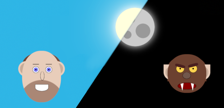
In a similar theme to last years single div Halloween spooks and ghouls I wanted to create a more detailed and more animated piece for this October: a man who turns into a werewolf at night.
- The Base HTML
- Adding Animated Transitions
- Styling the Labels and the Checkbox
- Sky, Sun, and Moon
- The Werewolf
- The Final Result
The Base HTML
The basic concept of the on/off switch is a checkbox (hidden accessibly with the focus style moved to the labels) with all resulting CSS based off of that.
<input name="werewolf" id="werewolf" type="checkbox"/>

<label for="werewolf" class="night">Night time</label>
<label for="werewolf" class="day">Daytime</label>

<div class="sky"></div>
<div class="celestial"></div>

<div class="werewolf">
    <div class="face">
        <div class="eye left">
            <div class="eyebrow"></div>
        </div>
        <div class="eye right">
            <div class="eyebrow"></div>
        </div>
        <div class="nose"></div>
        <div class="mouth">
            <div class="tooth left"></div>
            <div class="tooth right"></div>
        </div>
        <div class="hair"></div>
        <div class="ear left"></div>
        <div class="ear right"></div>
    </div>
</div>
The first thing you might notice is that there are two labels, one for each time state. I could have used a single label and changed the text with CSS, but I'm not a big fan of putting real content into pseudo elements for any of my regular front-end code, even if it makes little difference here.
The rest of the <div>s are the elements I've styled. With only one exception, every element is something which is shown in both day and night states, and uses only CSS to alter the visual appearance.
Adding Animated Transitions
I want the transition between man and werebeast to appear like he's actually morphing, not just a plain and immediate blink from one state to the next. To get this effect, I add a simple 2 second transition to all elements. While it's not generally recommended to do it like this for performance reasons normally, because my art piece is so small, the performance hit will be negligible:
* {
    -webkit-transition: all 2s;
    -moz-transition: all 2s;
    -o-transition: all 2s;
    transition: all 2s;
}
Styling the Labels and the Checkbox
First, I hid the checkbox and gave the labels the focus styles that the checkbox would have had:
input[name=werewolf] {
    clip: rect(1px, 1px, 1px, 1px);
    position: absolute;

    &:focus ~ label {
        box-shadow: 0 0 10px #f00, 0 0 8px #f00, 0 0 6px #f00;
    }
}
I didn't hide the checkout with display: none; because I wanted the labels to have focus styles, which won't happen if there's nothing that can recieve focus at all.
label {
    background-color: #eee;
    border-radius: 10px;
    cursor: pointer;
    margin: .5em;
    padding: 7px;

    &:before {
        display: inline;
        margin-right: .5ex;
    }

    &.night {
        &:before {
            content: "\01F31C";
        }
    }

    &.day {
        &:before {
            content: "\01F31E";
        }
    }
}
The extra content on the night and day are just sun and moon characters (which will show as emoji on systems with a supporting font).
Then it is just a matter of toggling their display based on the checkbox:
label {
    &.night {
        display: inline-block;
    }

    &.day {
        display: none;
    }
}

input[name=werewolf]:checked ~ label {
    &.night {
        display: none;
    }

    &.day {
        display: inline-block;
    }
}
This gives a nice toggle button effect that works with both mouse and keyboard.
Sky, Sun, and Moon
The sky is just a simple full height and full width <div> that sits behind all the other elements on the page and changes colour. The reason I went with this approach and didn't change the colour on the <body> was because I wanted to achieve this with pure CSS, and browsers don't yet have parent selectors.
.sky {
    background-color: #2eb5e5;
    height: 100vh;
    position: absolute;
    top: -30px;
    width: 100vw;
    z-index: -1;
}

input[name=werewolf]:checked ~ .sky {
    background-color: #000;
}
I make heavy use of the subsequent-sibling combinator selector (the ~ tilde) to select elements anywhere further in the tree after my selected checkbox. This is the linchpin of these types of checkbox styles, and is a technique I've used before to create a pure CSS build your own burger.
Next up is the sun/moon. This is actually only a single HTML element, which changes quite a bit based on the checkbox state:
Sun
Firstly, I create the appearance it should have when it's a sun, giving it a strong, bright glow, and a nice bright background:
.celestial {
    background-color: #ffd;
    border-radius: 50%;
    box-shadow: 0 0 30px #fff, 0 0 100px #fff, 0 0 200px #fff;
    height: 150px;
    left: 300px;
    overflow: hidden;
    position: absolute;
    top: 30px;
    width: 150px;
}
Moon
I wanted the moon to have some of its iconic craters, so I used a few background radial gradients to create darker spots. I then added a keyframe animation to slide these into view. First, I add in the craters using a pseudo element, then moving it out of view using a transform:
.celestial {
    ...

    &:after {
        content: "";
        display: block;
        height: 100%;
        position: absolute;
        width: 100%;
        background-image:
            radial-gradient(circle at 30% 60%, #999 20%, transparent 21%),
            radial-gradient(circle at 60% 30%, #999 10%, transparent 11%),
            radial-gradient(circle at 70% 70%, #999 10%, transparent 11%)
        ;
        transform: translate(-150px, 0);
    }
}
Then, to animate it into view:
input[name=werewolf]:checked ~ .celestial {
    background-color: #ccc;
    box-shadow: 0 0 30px #fff;

    &:after {
        animation: showmoonface 2s forwards;
    }
}

@keyframes showmoonface {
    100% {
        transform: translate(0, 0);
    }
}
The Werewolf
The rest of the werewolf resides entirey inside the <div class="werewolf">, which itself isn't styled and is just a wrapper for the facial elements of the man beast.
The face is split into several parts: the overall face, the eyes, nose, mouth, hair, and ears. I won't go into full detail over every line, because you can just look at the source code for yourself to see. One technique I did use a lot was CSS gradients, which created the 5 o'clock shadow and the iris and pupils of the eyes.
As with the moon transition, because of my use of multiple radial gradients on the eye, I had some trouble smoothly moving from the human state to the wolf state. Again, I used keyframe animatioins to add this in:
@keyframes iris {
    0% {
        background-image:
            radial-gradient(circle at center, #000, #000 15%,
                #7c7cfe 16%, #7c7cfe 50%, transparent 51%);
    }
    12.5% {
        background-image:
            radial-gradient(circle at center, #000, #000 15%,
                 #7c7cfe 16%, #7c7cfe 45%, transparent 46%);
    }
    25% {
        background-image:
            radial-gradient(circle at center, #000, #000 15%,
                #7c7cfe 16%, #7c7cfe 40%, transparent 41%);
    }
    37.5% {
        background-image:
            radial-gradient(circle at center, #000, #000 15%,
                #7c7cfe 16%, #7c7cfe 35%, transparent 36%);
    }
    50% {
        background-image:
            radial-gradient(circle at center, #000, #000 15%,
                #7c7cfe 16%, #7c7cfe 30%, transparent 31%);
    }
    62.5% {
        background-image:
            radial-gradient(circle at center, #000, #000 15%,
                #7c7cfe 16%, #7c7cfe 25%, transparent 26%);
    }
    75% {
        background-image:
            radial-gradient(circle at center, #000, #000 15%,
                #7c7cfe 16%, #7c7cfe 20%, transparent 21%);
    }
    87.5% {
        background-image:
            radial-gradient(circle at center, #000, #000 15%,
                #7c7cfe 16%, #7c7cfe 15%, transparent 16%);
    }
    100% {
        background-image:
            radial-gradient(circle at center, #000, #000 15%,
                transparent 16%, transparent);
    }
}
This slowly reduces the size of the iris at each 12.5% of the animation cycle, leaving the pupil remaining.
The other interesting aspect is the mouth, which is the only part of the face that contains elements that are only visible in the werewolf phase. However, the whole appearance of them is set up in the human phase, and is just given a height of zero:
.mouth {
    ...

    .tooth {
        position: absolute;
        background-color: #fff;
        width: 15px;
        height: 0;
        clip-path: polygon(50% 100%, 20% 10%, 100% 0);
        left: 0px;
        top: 0;

        &.right {
            clip-path: polygon(50% 100%, 100% 10%, 20% 0);
            left: 33px;
        }
    }
}

input[name=werewolf]:checked ~ .werewolf {}
    .mouth {
        ...

        .tooth {
            height: 30px;
            left: 5px;
            top: 1px;

            &.right {
                left: 45px;
            }
        }
    }
}
To shape the teeth, I used the built-in Firefox editor which made it a lot easier than writing by hand. The reason that I've also adjusted the left and top properties when transitioning to the werewolf is so that the teeth move with the mouth (as this moves with the face shortening).
The Final Result
See the Pen Werewolf by Ashley Sheridan (@AshleyJSheridan) on CodePen.
Comments